Friday, August 26, 2011

more prints from recent experimentations with vegetable oil relief printing ink

I have been putting some of the samples of the Aqualine printmaking inks I received from Rudolph Faust Co. of New Jersey a while back to the test. These I am told by the manufacturer are derived from a vegetable oil base. They have been tested at Duke University and meet all the standards to be labelled non-toxic.In the website they are being called water based but make no mistake they are indeed waterproof once they dry on the paper surface.
The ink will remain open on the inking plate and block surface for quite a while. What I also like about them is the low odor and the easy clean up with a little liquid dish soap and warm water.  I found that they do take time to dry much like a plate oil base ink and factors such as humidity, absorbancy of paper and thickness of ink will determine that drying time.
I also learned that some of the pigments used in a few of the colours have a bit of a transparent quality and therefore had to add a little white to increase opaque factor.

I think these will work very well for some of my classroom based activities for the above stated reasons.
Students I work with have pretty much used Speedball water based to date for relief printing applications but there have been some frustrations that include uneven thickness of ink when it is applied to relief surfaces, ink not coating the brayers in some spots.The most irritating thing would be the ink drying too quickly before it is printed from the block surface.

The two example prints both used the Faust Aqualine Ink.

The first is a jigsaw block study derived from a Blick flexible printing plate. This material allowed me not only to cut it apart but also to carve its surface with linocut blades. It has a peel and stick backing for mounting onto a board, card or in this case a thick paper base sheet.
The print is fairly small in size and thus proved a challenge for dissecting (which I ended up using a sharp point craft knive to achieve).
This was printed on Somerset Velvet black 250 gm rag paper with the aid of my press.


image copyright 2011 ã


The landscape below was created from three separate blocks. The blue and pink were printed first off of an uncut rectangle of Easy Cut material. I blended the two colors together by placing pink in the middle and blue on either side then rolling the brayer on the inking plate until a nice blend occured. This was transferred to the block surface and printed.
The second block (cloud formations) was cut from a piece of  flexible printing plate that was pre-mounted onto a heavier piece of bookbinding board. The ink I used was a 50% white and 50% transparent base mix so that some of the blue background came through as a lighter blue.
The last block was printed in black and defined the trees, islands and ripples in the water. The block was cut from a rectangle of golden cut linoleum.
The image was printed onto a piece of thin bleached mulberry paper with the aid of my small printing press.


image copyright 2011ã


Sunday, June 19, 2011

Magazine profile

I recently did an interview for Superior Outdoors Magazine, a publication based here in Thunder Bay and is found in fine bookstores and magazine stands in lakeside communities and larger urban centers both sides of the border.
The summer 2011 edition was recently published and is available on newstands and to subscribers. Unfortunately the current issue will probably not be available fully online for viewing until the next fall/winter issue is published but you can view back issues by clicking on the link. Below you can view the single page profile of yours truly with the block print they chose to accompany the article.
This magazine would have an appeal to readers who have an appreciation of the outdoors and nature. The articles and photographic images are top rate.
I am very thrilled to have been asked to be a featured artist in the arts and literature section. The theme found throughout a lot of my imagery is relevant especially with the focus on Lake Superior and the geography of this region of the province.


Superior Outdoors
Cover of Summer issue 2011


Also on a related note I have an exhibition of 27 selected pieces from my Wilderness series here in Thunder Bay at Calico Coffeehouse. This establishment is located in the lower level at 316 Bay. St.  The display runs until August 6. Here is a link with more details as featured in the locally published Webzine The WallEye
http://www.thewalleye.ca/2011/06/14/studies-from-holdens-wilderness/


Sunday, May 22, 2011

Continuation of miniature polymer plate etchings with hand colouring


This study is a continuation in a series of small polymer plate miniatures. The last one is this titled The Swan
I had some small leftover pieces of solar plate from a large 16 x 20 inch piece I had cut up earlier this year so decided to use these up and create miniature works in a square format.
This is based on a photo I had taken from the deck of the Chicheemaun ferry that crosses over Lake Huron from South Bay Mouth on Manitoulin Island to Tobermory at the end of the Bruce Peninsula. It is a study of Cove Island lighthouse that is found about 20 min. offshore from the village of Tobermory.
It was printed with oil based etching ink into Magnani revere rag paper then watercolour was added for the colour.
The plate size is 5 x 5 cm (2 x 2 inches) and the paper is 15 x 15 cm (6 x 6 inches). It will be an open varied edition.

I am hoping to get some more photo studies of lighthouses of the Great lakes in the near future. Have some friends who are boaters who have agreed to help out.

Thursday, April 28, 2011

Relief printmaking using styrofoam

This is a continuation of my last entry regarding earlier works not seen before.
The following prints were created by drawing into the surface of 1.27 cm (1/2 inch) thick blue dense styrofoam from a building materials supply shop. This is generally used for insulation of walls during home construction or renovation. It is not that expensive and can be easily cut into blocks from the main sheet with a ruler and utility blade.
I used ball point pen primarily as the drawing tool as it tends to score the surface much better than pencil (which catches a lot in the material). Some of the finer lines were created using a compass point needle tip but again took a bit of effort dragging this through the styrofoam.

These were all example pieces created as part of demonstrations for relief printing with styrofoam lesson I have to elementary school children during the past several years.

Dog portrait

two block study of flower forms
 printed in a light blue waterbased ink over a solid black square


songbird on tree branch

simple sunflower form (slight dot detail in the blossom) against a dark background

landscape
white ink printed on black paper
the hockey game
tan ink on black paper
Light comes through
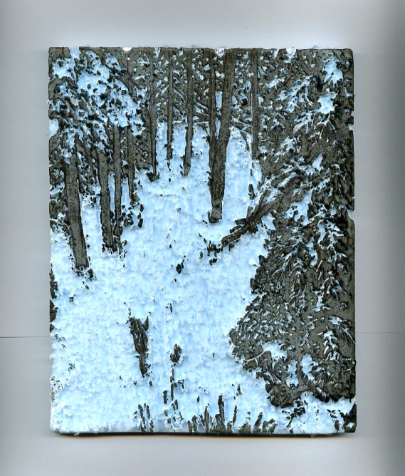
two block colour winter woods study

the key block (black)
notice how the styrofoam has been flecked away to reveal a loose type of surface

Tuesday, April 26, 2011

Some prints from a long time ago

I found a few photos of some of my earlier printmaking adventures that not many have seen so thought I would share these with my blog followers.

two colour linocut from 2006
a study of a sailing regatta in Thunder Bay


A relief print I made in 2007 from a piece of scratchfoam.
I drew into the thin foam plate using a ballpoint pen to create the relief.
Instead of printing black ink onto white paper white ink was applied and then hand burnished onto a piece of black stonehenge paper.
Inspired by a visit to Killarney Provincial Park near Sudbury, Ontario.


In 2009 I took a scan of a black ink print on white paper from one of my larger carved pieces of linoleum.
 I resized and then reversed the image, printed it onto an inkjet transparency and exposed it as a negative on to a small piece of solar plate. The plate was developed and I applied ink with a brayer on the surface and printed it as a relief image using block oil based ink onto 140 lb cold press watercolour paper. I then applied hand colouring into the print using watercolour. You can get a sense of the size of the printed image as the frame dimensions measure 5 x 7 inches, so it in effect is a miniature print.


2005
another experiment of relief printing from four blocks
made from 1/16 inch thick craftfoam. Pieces were cut out and glued onto a cardboard base sheet.

A cosy place 2006
This is a small drypoint study printed from a drawing
 made with a drypoint needle into thin piece of aluminum plate


Heat/Sunspot lover 1987
I made this relief print using a product called Fujiblock that was made by the UK based Windsor and Newton Company known for their fine grade watercolour paints
The block was a stiff piece of cardboard that had a thin layer of felt material glued on top. You cut away the surface material using a double bladed utility knife, then peeled off the thin cut lines and then applied watercolour onto the remaining surface. The media was allowed to dry then reactivated by misting or you could also print onto damp paper to give a unique white line print.

this was a multiple plate square format collagraph
2006

Sunflower linoluem relief block print with hand colouring
2005

Songbird
2005
a simple relief print from a piece of 1/2 inch blue building grade styrofoam that I drew into with a ballpoint pen. I hand burnished the black ink coated block onto torn piece of amber colour japanese Chiri paper.
It has been mounted to float inside a birch shadow box frame.

another multiple plate collagraph
2005

collagraph/monotype
2005

Thursday, April 21, 2011

Translating a pen & ink sketch with wash to a solar plate etching


a version that incorporates chine collé using hosokawa kozo (a light gold hue)
that is adhered onto Awagami bamboo ph neutral rag with wheat paste

This is the first proof of a new study that was printed from a small piece of Solar plate. It is a study of one of our pets named Dharma (she is no longer with us). Cats (and let's not forget dogs) are the perfect models as they usually don't give a whole lotta attitude (mmm... ok maybe the cats are more well known for this) and they work for nothing.
I saw Dharma napping and noticed a great pose and play of light that just beckoned me to capture this in some artistic format. It also was a good opportunity for me to experiment a bit more with polymer plate etching.
I have titled this Catnap. It is printed onto a piece of white Somerset Velvet cotton rag 250 gsm paper using Graphic Chemical Intense black oil ink.
Plate size is 7.5 x 12 cm (3 x 4 5/8 inches) and the paper size is 15 x 20 cm (6 x 8 inches)
this will be an open edition


 detail from Catnap


This started off as a pen and ink outline sketch on acetate done with a technical pen.


On an overlay piece of Grafix wet media Dura-lar film I applied washes of watercolour to define the form.
This film works very nicely with water based media like watercolour, acrylic , gouache, ink.

I then applied Rotring opaque black latex ink for film with a brush to define the background and in the cast shadow of the foreground leg and paw


The last step wash to add another subtle diluted wash of ink to the foreground underneath the cat for definition. This was added right onto the positive.
I combined all of the acetates and made one positive. This was exposed in my homemade UV exposure box using a double exposure method of 3 min. for aquatint screen and 3 min. for the positive. It was developed in lukewarm water with a gentle scrubbing of a soft toothbrush, then post exposed another 10 minutes.

Wednesday, April 20, 2011

Hosting a Monotype workshop


Giving a demonstration showing the application of watercolour onto Dura-lar wet media film 

Last Saturday I had the honour of conducting a workshop in Monotype printmaking for 14 enthusiastic members from Lakehead Visual Arts, a club I have been a member of since the mid 1980s.
I had been approached a while back by the club to see if I could give some type of printmaking activity that members could do in a one day session and that wouldn't be too expensive for supplies.
We explored two methods. The morning was spent working on subtractive monotypes using oil based etching ink that was rolled out on plexiglass plates from a brayer. The artists used a variety of tools including bamboo skewers, pieces of paper, tissue, blending sticks to remove ink from their plates. These were then printed onto soaked and blotted cotton rag paper using an etching press.

subtractive monotype by R.Vilim ã

working into the ink covered plexi to remove ink

the resulting print in reverse on paper after being pulled through
 the etching press onto damp cotton rag paper


subtractive monotype swine study by R. McKenzie


assisting one of the participants run a plate through the press

The second method we explored during the afternoon session was additive monotypes. Participants were given a piece of clear wet media Dura-lar film. They were able to put sketches and/or photos under it to use a painting guide. The wet media film allows washes and thicker applications of paints such as watercolour, gouache, createx monotype inks, and also acrylic paint and ink.
By placing dampened paper over top and using either hand burnishing with a tool or by running the film and paper through the press a transfer is made onto the paper. The painted medium can be dry or wet. If it is dry the damp paper will reactivate it. If you print onto dry paper you can apply a light misting of water to the plate or paper to facilitate activation of the media and allow transfer.

watercolour transfer by G. Postans made from Dura-lar
onto rag paper using the table top etching press


Since nearly everyone in this club are painters I thought that monotype would hold appeal, especially for the additive type where one can apply paint on a flat surface and transfer it in reverse onto paper.


watercolour monotype by R. Vilim ã


watercolour monotype by S. Bishop ã


participants working on their plates

Sunday, March 20, 2011

Continuation of printing an older block onto Bamboo paper

Moon and Forest
linoleum block print
Image size: 10 x 10 cm (4 x 4 in.)
Final trimmed paper size: 20 x 20 cm (8 x 8 in.)
open edition


This study titled Moon & Forest is the continuation six years later of a linoleum block print that was started back in 2005. At that particular time I was printing only using hand burnishing and using water based inks. I couldn't really achieve a good solid print then and so I put the block away after getting frustrated and producing only a handful of prints on paper.
Last night we were viewing that once every 18 years supersize full moon through the fir trees in my yard (it was a bit obscured by clouds so didn't really see much of it here). Somehow it reminded me of this image and planted the idea to try printing again now that I have better inks and a press.
This morning in the studio I dug through drawers that contain old blocks that have not been cancelled.
Lo and behold the blocks were still there and in good shape (I had protected them in a small box).
The background block incorporates a slight jigsaw option, for the details in the moon face are a circular shaped piece that pops out and is inked independently of the background square. I carefully set it back into place using tweezers after applying a light blue-gray color of ink with a small 19 mm (3/4 inch rubber brayer). For the blue background I put a little Daniel Smith Pthalo blue and titanium white side by side on my inking slab. Using a 6 inch brayer I continuously rolled out the ink until the two blended together. The gradient blue blend came out very subtle (in the first image posted at top) and although I would like a bit more of a lighter blue horizon towards the bottom, I am content with the first few proofs that were printed.

The second block (keyblock) had Daniel Smith carbon black oil applied with another brayer..

This print used my 3 hole punch registration board system and was printed using the slight pressure from the top roller of my printing press. I set a piece of  6 mm (1/4 in.) tagboard over the printing paper and ran it under the roller once the proper pressure had been set with the turnable pressure gauge handles. I did a test print on newsprint first to make sure the blocks lined up on the registration board.


This is also the very first time I have printed onto Awagami Bamboo paper. It is recommended for letterpress and relief printing so decided to see how it handled. I quite like the end result and although it is a stiff 250 gsm paper it performs well when using a press for printing.

Don't think I would want to hand burnish onto this as it is fairly weighty and stiff in nature and needs a bit more pressure to give a good solid and even transfer of ink.
To achieve this I applied a very light mist of water before setting the paper on to the inked block.

It will take a few days to dry but  have the few I printed hanging on a line in a warm and dry basement.

Tuesday, March 1, 2011

Printsy - Printmakers of Etsy - Interview with yours truly

I have been given the honour of being this weeks featured Printsy artist
if you would like to read the interview and view of some examples of recent work you can click the following link:
http://www.printsy.blogspot.com/

Thursday, February 17, 2011

Elementary School art - Exhibition of printmaking created by Grade Fives

In a recent blog entry I outlined a little about some classroom based projects I have undertaken with two elementary school classes. This is through a program called Artists in the Fifth, which is offered annually to our regional schools through CAHEP. This means Community Arts and Heritage Education Project.
Artists are given the opportunity to work with teachers and their students in a predetermined number of arranged visits and we deliver interesting projects in the visual arts, written and spoken word, music and performance based artistic endeavours.

The results are presented each February in a half day event called the Arts Fiesta. This public exhibition and live performance event is hosted at our local community auditorium.

Yesterday I had the opportunity to set up the display of the projects that were created by the two grade five classes I visited through the Artists in the Fifth program.

Here are some photos that I took today at the Fiesta and the accompanying project outlines for both.

The first three are photos of a project titled Impressions 2 (the 2 should actually be smaller and floating higher as it represents the symbol for squared)


Project #1

Title : Impressions squared 
This project combines relief block printmaking together with sculpture. The images explore the principles of design in each of the learner prints. Sculpture is also incorporated using geometric cubes as surfaces to display random arrangements of hand printed images. The prints are not only repetitive in composition but each learners design has been printed in different colour combinations. The theme Thinking Outside the Box has been taken both literally and figuratively. Two forms of art have been fused together to create one colourful, visually interesting deconstructed larger scale cube made up of smaller cube/hand print components.
Learners were encouraged to think about the concept of repetition as it could be applied to a basic design. They were also challenged to think about the principles of design in the artwork. During the project they learned about such important areas such as line, shape, positive and negative space, rhythm, repetition, texture, composition, contrast to name but a few. Using linoleum cutting tools they were able to carve their images into a soft composite material and apply ink to the relief surfaces and print these in two colour combinations on paper using traditional hand printing methods.
An emphasis was made on focusing on complementary and split complementary colour combinations in the hand prints allowing for stark contrasts and impact in the images.
The learners printed a solid colour square first and then the cut side of the block with their design was printed over top in a contrasting colour.
Special recognition is extended to educator Terry Cano who spent many hours after class constructing, affixing prints to the cubes and assembling everything to create the sculptural part of this project.


Project #2


Project title: Construction

This project uses relief block printmaking as the basis for the creation of hand printed imagery that utilizes several stages of process from start to finish.
Learners were given the opportunity to use two surfaces to create a two colour print on paper.
One surface was left solid and the second surface was carved into using special cutting blades to produce a relief design. Prints were produced by using careful registration of paper and application of ink to both sides of a block in two separate printing sessions.
To begin the project, the learners were encouraged to think about and share dialogue revolving around the concept of the word structure.
Using photo reference they focused on a particular section of either a manmade or nature made structure. They enlarged the chosen area and proceeded to develop it and construct a colour print that would allow it to be viewed in an entirely different way.
This is where adhering to the theme of “thinking outside of the box” came into play.
Learners were also challenged by utilizing the principles of design in their respective works of art. During the project they learned about such important areas such as line, shape, positive and negative space, rhythm, repetition, texture, composition, contrast to name but a few.
Using linoleum cutting tools they were able to carve their images into a soft composite material and apply ink to the relief surfaces and print these in two colour combinations on paper using traditional hand printing methods.
An emphasis was made on focusing on complementary and split complementary colour combinations in the hand prints allowing for real contrasts and impact in the images.
They printed a solid colour square first and then the cut side of the block with their design was printed over top in a contrasting colour.