Thursday, April 9, 2015

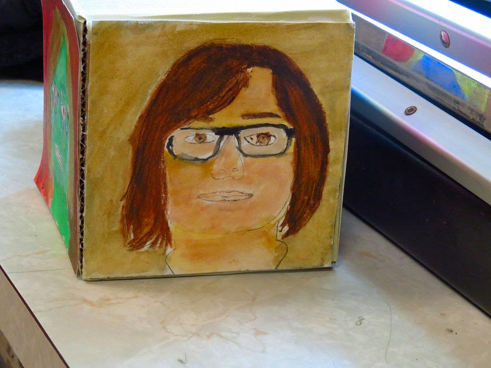
Art in the Public Schools - Grade 5 and 6 drypoint with watercolour addition


I just completed a several visits to 3 classrooms at a local Elementary school through my Ontario Arts Council funded Artist in Education program placements. Students were engaged in a project that had them interpret a photo portrait that was taken of each of them into a drypoint line print on paper. 


This was another version of a You Cube relief project I did at two other schools earlier in the year. However this time around I used intaglio as the basis for creation of the imagery.

Thin packaging plastic was used to achieve this. The plastic is heavier than acetate but thinner  
in density than plexiglass. I fashioned etching needles using darning needles inserted into pre-drilled ends of wood dowel and secured tightly using masking tape rolled around the eye end of the needle.
Akua black intaglio ink was wiped into the scratched images and the surface of each was polished using yellow pages torn from old phone directories.
3 prints were made by each student onto 250 gm rag paper and by manually passing the inked plates, paper and felts underneath the adjusted top roller of my table top etching press. 


We allowed a week for drying of the ink and then the prints were taped onto corrugated plastic boards. I put together individual foam plates with button sizes of 12 hues of tube watercolours and students applied paint into the monochromatic studies.


The final stage of this project had students take the trimmed prints and fasten them using liquid white glue onto 3 sides of a 14 cm (5.5 inch) square corrugated cardboard box.


For public presentation 12 cubes will be stacked in a vertical format (fastened together between top and bottoms of each square using double sided tape. I will place it on a larger cardboard base sheet to help with stablility. We should have around 10 columns that can be viewed from 360 degrees. One side of each box will open like a small door and students will place a handmade clay object they will make that best represents some aspect of themselves.


Monday, April 6, 2015

Teaching art in elementary grade school – mix media and relief print murals (Jr. primary grades)


In the trees
Brodie Resource Library
April 2015
created by grades 1/2 students
Hyde Park Public School
Teacher: Susan Lieske
Art Educator: Brian Holden


I have been giving art instruction to a grade one/two split class at Hyde Park Public School in Thunder Bay. I have been very fortunate to be paired with a highly creative minded teacher, Susan Lieske. These eager and enthusiastic young artists have undertaken a few projects with me since November.


Two projects that were recently completed in this particular classroom are currently on display at the Brodie Resource Library here in the city of Thunder Bay. I was approached by a committee from the library who saw the vision of public and school based art on a few walls in the library system.


Yours truly assisting a student to make a cut paper shape and modified acrylic paint monoprint.


The first project is a series of panels that have the option to be displayed either in a vertical or horizontal presentation. In the first of the 2 art displays I had long open shelf tops available in the venue and  thus arranged the panels in one long panorama style display.
This particular series explores Animal Totems in the theme. Students chose animals indigenous to this region and working from photo references made a sketch onto a thin flat plate made of dense styrofoam. Water based block printing inks were applied to the plate surface using synthetic soft rubber brayers. Prints were made onto pre-cut squares of black mulberry paper. I mounted the prints onto black mat board panels.

I also connected the animals to regional first nation culture and we learned the name of each of the creatures from the Ojibwe language.  The full list of createures are listed on the last panel that is included below.


Eagle 
Migizi


Bison
Mashkode-bizhiki


Hummingbird
 nenookaazi

Goose 
nika

Raven
niiwin


Moose
mooz

Black bear
makwa

Woodpecker
baapaase


Bobcat
gidagaa-bizhiw

Owl
gookooko'oo

Marten
waabizheshi


In a related pursuit Susan Lieske had her students research their animals, look at their significance from a first nations connection and put all of this into hand made little accordion fold booklets. These are also available for the public to look at and read just below the panels in a wall pamphlet system.


The second more recent project I have this class was the creation of a mix media collective mural.  It began with me drawing 2 large tree shapes over a 4 x 7 ft arrangement of bristol board pieces into a grid of 4 up by 6 across (for a total of 24 rectangles). I encouraged each student to retain the bare branch shape passing through their rectangles but to bring each part of the tree to life using drawing, painting, relief stamping and collage. The mural is titled In the trees. It is a large colourful mosaic of colours, shapes and textures and also the viewer can make out the tree shapes that define everything when it is assembled. I think that each individual panel is a work of art unto itself.


Sunday, April 5, 2015

Teaching Art in Public school classrooms - Grade One art


Nanabijou - The Sleeping Giant
mix media
Grade 1
St. Elizabeth Catholic Jr. Elementary School


This past week I completed a 50 hour residency in a local elementary school that began in mid-February.

I visited five classrooms using a once per week visitation schedule. Each visit was approximately 100 minutes in duration.
I was paired with teachers and students from 2 grade one, a grade five and 2 grade six classes.

Both classrooms with grade one’s undertook 2 projects.
The first project was a visual storyboard that explored a different theme in each class. The first class explored the legend of Nanabijou. Those of us who live here know it here as the Sleeping Giant, a rise of a land formation on a peninsula that is located across the bay from our fair city of Thunder Bay. (see photo at the head of this post). 

The second grade 1 class explored landscapes of Canada.


Stage 1 was to teach the young artists basic drawing composition (shapes) and colour theory/colour mixing. They were given trays of water based acrylic paints and with brushes had to lay down areas of primary and mixed secondary colours onto rag papers.  


Stage 2 was to  have them draw shapes in pencil on a 10 x 13 inch all media paper based board. This would establish the composition from which all other media would be applied to construct each storyboard.


Stage 3 had students create thin foam plate stamps by drawing shapes (plants, animals, etc…) in the foam surface, cutting and gluing these onto a recycled cardboard base. Water based relief printing ink was rolled on the stamp using a soft rubber brayer.


In stage 4 students cut out pieces of their colour areas that they painted in stage #1. They also cut shapes from pieces of oriental papers that I brought to class with me. These were then glued into strategic areas to add texture, colour to the pencil shapes.

Finally markers and other dry media were used to add definition (outlines and details) to the works.


The second project was the same for both classrooms. It had students brush white glue onto a balloon (these were set into plastic containers and held in place using small tabs of masking tape). The students them applied strips of newspaper using a wallpaper paste adhesive over the glue on the top half of balloons (paper mâché).     I took these home once they had dried and applied additional layers of Modge Podge mixed with white acrylic paint to seal and prime the molded paper. The balloons were deflated and carefully peeled away from the paper. I trimmed each to create a white bowl shape for each student.


 The final stage had students paint acrylic paint onto the exterior and interior of each of their bowls. We set the bowls into Styrofoam bowls to help keep them stabilized while the paint was being applied.


The paper-mâché bowls were the take home component of this project. The mixed media storyboards will be given an exhibition opportunity in a couple of weeks time at a branch of our city’s Public Library.


Monday, February 23, 2015

Mix media - drawing, plate etching and painting


 Canoe Trip 
close up of the final work on paper with 
 watercolour and acrylic ink applied
 into the print using a brush


In 2009 I created a work titled Canoe Trip that began as a pencil sketch. I converted the sketch to a plate etching. This was possible by using a light sensitive polymer coated thin metal plate. I made a high res. scan from the sketch and then printed it in grayscale onto a clear inkjet transparency. Additional details and elements were incorporated by using technical pen and thinned washes of black tusche and water onto the film.

I exposed the film positive onto a solar plate in two stages. First I pre-exposed a fine dot screen onto the surface of the thin metal polymer coated plate for about 3 minutes under an home made exposure unit consisting of 4 rows of UV emitting black light. The half tone screen (aquatint screen) that I placed on top under a piece of clear glass would allow variations in tonality from the sketch to be captured onto the plate surface. I then followed this with a 3 min exposure of the actual inkjet transparency. 
I developed the plate using lukewarm water and gentle scrubbing with a soft bristle toothbrush post exposure. The plate was hardened by post exposing it once again under the UV blacklight.
Oil based etching ink was applied to the plate surface and wiped into the etched surface of the polymer. Damp 250 gm cotton rag printmaking paper was placed over top of the plate and was then printed on my small etching press by hand turning the wheel to move the press bed under a tightly set top roller.

the single colour print on rag paper. I secured the print onto a piece 
of smooth  masonite board using gum adhesive butcher's tape.


I started to paint colour into the print using washes of fine watercolour pigments. 
Below are some of the brands that I like to use for my painting applications. These are in tubes and my palette includes Fragonard from France, Daniel Smith and Da Vinci manufactured in the USA.


I also applied thinned out washes of liquid acrylic inks made by UK company Daler-Rowney. These gave me a bit more intense colour when I thinned them with water and applied it to the print.


the cloud shapes were blocked out with masking frisket. It was carefully removed by rubbing with my finger tip once the washes that define the blue of the sky had dried.


early stages of mapping in colour using watercolour paints


A close up showing the interplay of the transparent layers of colour media applied into the etching.

The final result from the marriage of pencil sketch, plate etching and painting.