Showing posts with label Lake Superior. Show all posts

Sunday, June 11, 2023

Engraving from end-grain maple block


Coastline- Lake Superior
wood engraving/hand-coloured
open editon (varied)
2023


Recently a fellow printmaker (master engraver) who is a good friend I have known for at least 25 yrs sent me with a couple of pieces of end-grain wood he wasn't planning on using. To date I had only engraved into Resingrave (a synthetic hard polymer) and old hard dark brown linoleum. 

I had been wanting to try end-grain but encountered difficulty in sourcing it here in Canada. I was forced to put that earlier idea into the "do that later" mental files. 

My printmaking friend had seen some recent small lino and resingrave work I showed him via email and he decided to help me obtain some traditional end-grain hardwood that he has used throughout his career as wood engraver, artist/illustrator and run a small gallery to showcase his work in his residence. In addition to the section of maple I was also sent an equal size piece of rare old boxwood. 


I had the wood pieces cut to specific smaller size blocks by a local cabinet maker who had the recommended vertical bandsaw to cut with the grain (which is vertical orientation for the almost 3/4" thick blocks. The maple block I was sent is around 1/2" in height.

I was fortunate to have a small tabletop Blick etching press that allows enough clearance between the press bed and bottom of the top roller set at it's max height to accommodate paper and a smooth piece of hard paperboard. 

I chose a landscape to sketch from a photo I had taken a couple of years back taken during a trip east to visit family. This is typical cambrian shield rocky outcrop that borders the north shore of Lake Superior on the Canadian side of the border, One will often find low bush blueberry shrubs, harebell flowers growing out of cracks in the rock. The rock also has a lot of lichens spreading across the ancient granite face. It is one of my favourite things about living here in the region where I do.

Below are a few photos that illustrate the creation of the print. They show a bit of the progression from after I had carved the block surface and through to the final colour version on paper. The first photo is my working set up and I place most of the tools nearby as well as the leather sandbag to help me keep the block stable while it is engraved. I also use a crocker sharpener system with light mineral oil and an arkansas oil stone to keep the tool tips nice and sharp. I will give a particular tool I plan to use a quick pass back and forth across the oil stone and it makes cutting into the wood surface less difficult to cut.

For the hand-colour element again I introduced watercolour with small fine tip watercolour brushes.


Wednesday, March 27, 2019

miniature mix media prints - landscapes

Near Rossport
polymer plate etching with hand colour
2019
print image size: 4 x 7 cm (1.5 x 2.75 inches)


You might notice that the image at the beginning of this blog entry bears a similarity to a work featured in my last blog entry. That previous image was a colour linoleum block print. You would be right because it is very similar in fact. I adapted the same view and composition using a different printmaking methodology. It is also  about 1/10th scale in size and is therefore officially a miniature.  It also incorporates hand colouring to become an original mix media work on paper. (intaglio print & painting).

The sketch I made for my lino was scanned and reduced in size. I then printed it using black inkjet ink onto clear film. This was then exposed using a fine dot aquatint screen and UV light onto a small pre-cut piece of polymer plate (solar plate) that I had rounded the corners using a metal file. 


The image was etched into the plate surface by exposure to the light. Gentle scrubbing with a toothbrush and using tepid water removed surface area to reveal the image. I exposed the plate again (without the film) to UV to harden the polymer for good.


Black oil based etching ink (cranfield safewash) was wiped into the shallow recessed etched areas and I then put 250 gm weight cotton rag paper over the plate. A lot of pressure was applied by running it under the roller of a small etching press which transferred the image to the paper. The printed image is then secured to a board using moistened paper tape (also used for watercolour painting) and set aside in a warm space to dry (up to a week or more duration) 


print on paper and the plate from which it originates. Notice how the image is in reverse on the plate.


Once the etching ink dries I apply colour into the print using washes of thinned liquid acrylic inks with synthetic taklon brushes. The paper is then cut to size with the bottom leaving a deckle tear edge created by folding over a special ruler with a rough tooth.


The resulting print with colour. Each print on paper is different because of differences produced during the painting application. 


My plan is to continue with this same format in a series of miniature prints that are based on landscapes found around the region where I live.

Thursday, February 7, 2019

First new artwork in a while - rework of an older piece

Near Rossport along Lake Superior - 2019
four block relief print (7 colours)
image size: 15 x 20 cm ( 6 x 8 inches)


                                      My apologies to followers of this blog. It has been nearly six months since my last blog entry. I am still dealing with health related challenges and there are limitations in the scope of what I am able to do and for what length of time. However my creativity has not been stifled and I am making it a point to keep the proverbial creative fires stoked.


One way was to return to an old image and produce from it again with slightly different elements. I found an older block of mine that was carved back in 2007. The small edition six colour print originated from one carved linoleum block (key image) and three thin pieces of stryofoam mounted onto mat board plates. The shapes were drawn into, cut and mounted carefully on their supports. 
Prints were made by passing the blocks and paper under a roller (with set pressure) on my small tabletop etching press. However over time from multiple passings the styrofoam quicky deteriorated and cracked.


progress proof before some minor additions


I decided that a new version could be printed this time around by replacing the styrofoam with carved raised linoleum elements. There have been some changes in terms of water, and a mid background landform.
This was also an opportunity to use Graphic Chemical water based relief printing ink. The ink is very sticky (but keeps open on the glass slab for a day or two). It is not oil based ink but the base that suspends the colour pigments is derived from plant sources. Once printed onto an absorbent paper surface it dries quickly (a few hours in the right studio conditions.)

Tempered glass inking plate with Graphic Chemical water based relief printing inks and two sizes of rubber brayers.


Four blocks in total were used. Two blocks had separate pieces of lino cut apart that were glued onto an equal size substrate. Since some elements had separation between them I was able to use one block to print 3 colour elements in a single pass. Small brayers allowed me to apply ink to the raised lino shapes. The first block that created the water and sky used a blend of inks rolled out on the glass. I put two small dollops of different tones of blue and then a bit of white ink beside the lighter blue.


A registration board system was used that had a 3 hole punch to hold the paper in place and also an area that the blocks of equal size could be held steady and would line up when printed in layers.


progression from block #1 - blend of blues and white followed by the layer of ink from block #2 far dusty blue-teal landform


Wednesday, May 2, 2018

print from a single plate that combines three techniques

https://www.etsy.com/ca/listing/612814647/small-landscape-combination-drypoint?ga_order=most_relevant&ga_search_type=handmade&ga_view_type=gallery&ga_search_query=&ref=sr_gallery-1-39


Back in October of last year I posted about a print I had made from using a single clear acrylic plate. 
http://myprintmakingjourney.blogspot.ca/2017/

This combined colour relief roll, monotype and drypoint. I had only made a couple of prints at that time. The plate was put into a safe place and I became involved with other projects   

Over the past couple of days I decided to return once again to printing a small edition off of this plate. I took photos during the process which I believe may explain better how I achieved each print on paper from the plate. I am hoping to print an additional 6 for a total of 20 over the next day or two. To date I have printed 13.

I am printing these using Caligo Safewash etching inks. The etching ink is also used for the relief/monotype stage.


Each print is made onto Somerset satin white rag. Using moisture activated butchers tape I affix each print onto a thin mdf panel where they are allowed to dry. The tape also keeps the slightly damp paper from buckling. 


The plexiglass (aka perspex) plate. Here the surface scratched line is revealed by applying and wiping black etching ink across the surface.


The plate showing colour relief roll of ink on the surface and the beginning stages of subtractive monotype. I create a colour blend for the blue on another larger piece of acrylic using a soft rubber brayer. I achieve this by applying prussian blue with a little white to establish the darkest hue at the top. I set a little white a couple of inches beside this and by rolling the ink with the brayer forward many times the two intermix until a nice blend from dark to light occurs. I then carefully transfer this from the roller onto the plate surface.
The light biege ink on the bottom foreground rock was applied with an even smaller width rubber brayer. This is achieved by first determining by eye where to start the brayer to meet at the line of blue and moving it across the surface to deposit the ink and not touch the wet blue ink. It requires a bit of skill and steady hand co-ordination.


Here you can see where I have removed ink using various tools (cotton swabs, rolled tissue, tip of a bamboo skewer) that will print as negative space.


Result of the printing of the colour relief roll and monotype for the first stage. 
The plate was set onto the press bed inked side facing upwards. I used a registration sheet underneath with markings made in light pencil to center the plate and also indicate where the corners of the paper should be. Soaked and blotted Somerset satin 250 gm rag was set over top. A piece of clean newsprint was set over the somerset and then the three wool felts were placed over all of this. The plate had a 45 degree bevel filed along the edges earlier. The pressure of the roller created an embossed mark around the print edges during printing. This will assist in positioning the plate a second time (ink side facing down) for the drypoint.


The colour ink residue was cleaned off the plate surface (using a rag and vegetable oil). I wiped carbon black etching ink into the recessed lines that were scratched on the plate earlier (the drypoint component). 
So now came the really tricky part. Carefully using a combination of steady hand and eye coordination I positioned the plate ink side facing down and set it over top of the colour print. The emboss from the bevel helped me to set it into place. 
I then set my clean hand over the plate. I placed my other hand underneath the paper and with a bit of slight pressure set it under the area where I had the plate pinned to the paper with the other hand on the opposite side. 
I slowly flipped it over so that the plate was underneath. I set this down on the press bed at a 45 degree angle and as the plate was lowered into a horizontal position I removed my hand slowly from underneath but made sure my hand over top of the paper and plate was pushing and making sure the plate wasn't slipping out of position underneath. I could tell once the paper was down flat as the raised shape of the plate from the previous printing held the plate in position. 
Clean newsprint was set over the back of the paper and once the felts were lowered. This time I set the hand that wasn't turning the press gears on top of the felts over the plate and paper area to hold in place until it was caught by the edge of the roller as the bed was moved under the roller.
When I lifted the paper after it had cleared the roller on the other side I saw that the drypoint element had printed nicely where it should be and the colour underprint was also in alignment.


Prints drying in a warm room. I use both sides of the boards to attach prints so angle them slightly out from the wall to allow for airflow on both sides during the drying process.


Wednesday, September 28, 2016

Lake Superior shoreline collagraph


It has been a while since my last post and the new collagraph study that was then in progress. The good news is I found some time to add in colour to the print. However before this occurred I took a weekend roadtrip to this spot depicted in the print image to be inspired for my treatment of the sky and landscape. Good fortune smiled on me that weekend with warm and sunny early fall weather conditions.
I returned with quite a number of photos from which the final image shown above emerged.


I applied caligo safewash etching ink to the plate surface with home-made felt dabbers. The plate was wiped back with bunched up tarlatan fabric followed with a good wipe of old yellow pages. I rolled a little ink onto the foreground trees that were raised slightly already. This helped to define them a little more. Soaked and blotted italian milled rag (magnani) was set over top of plate on the press bed.
I used both tube watercolours and washes of liquid acrylic inks to colourize this first of several prints on paper that had been printed in just a single colour.


detail from left side

I plan to pull a number more prints from the plate soon and get an edition established. There is an opportunity for me to have the color framed study make it's debut in a regional print exhibition here in Thunder Bay starting Oct 15, 2016 at our waterfront Baggage Building Arts Center.

Sunday, August 28, 2016

Recent activity in the studio pt 1 - panoramic collagraph


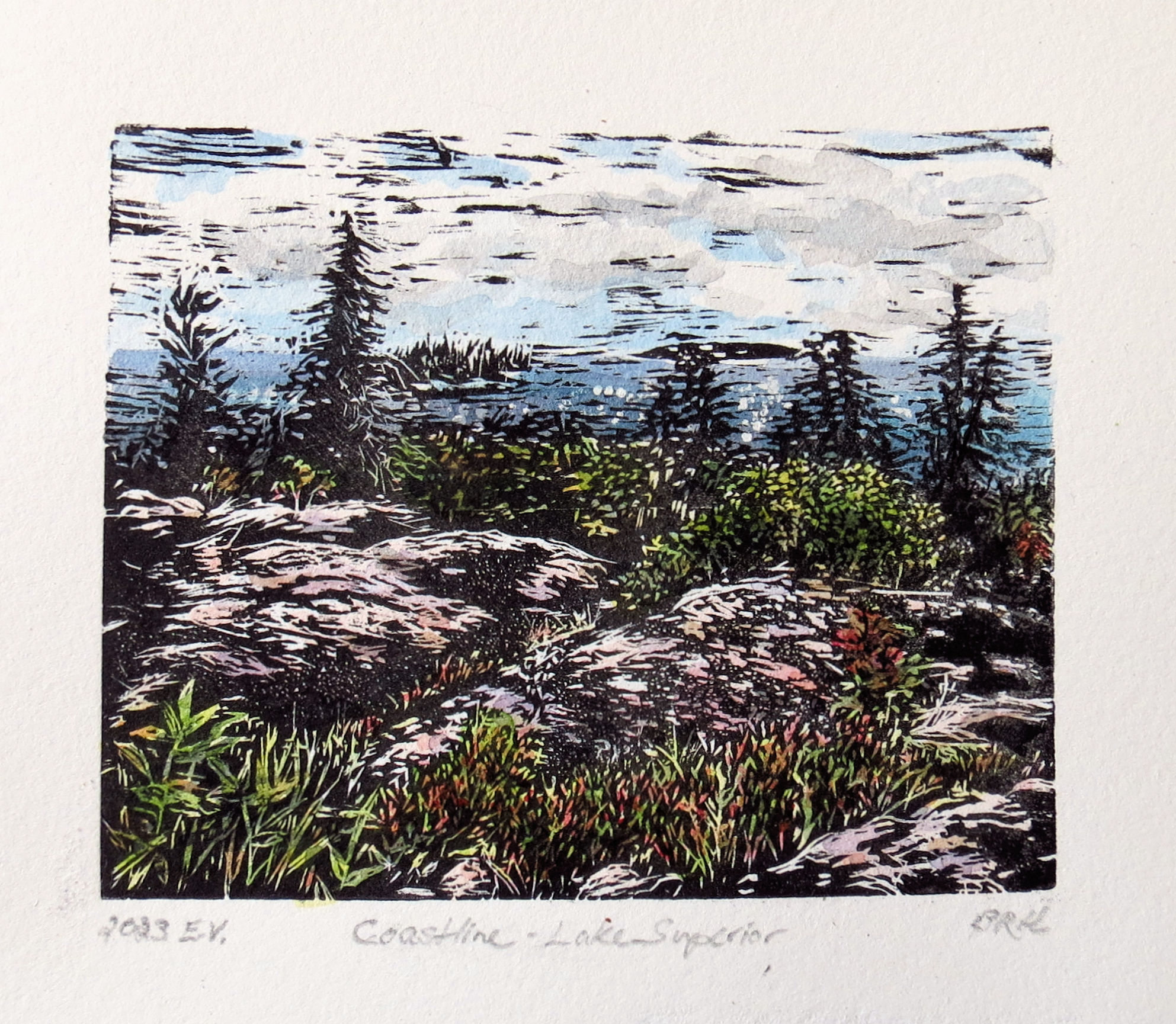
Panoramic plate that will produce a printed image that measures 14 x 55 cm (5.5 x 21.5 inches.)
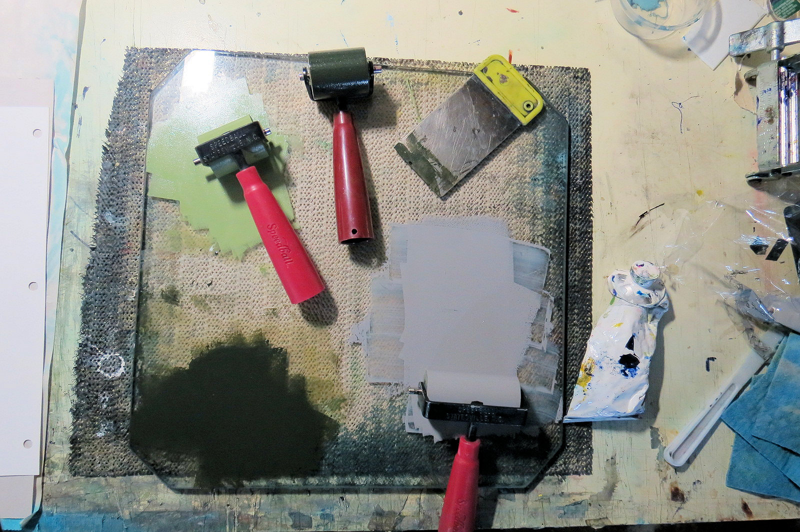
The plate has been sealed with several layers of clear shellac and now awaits the application of ink, wiping back and passing through the press.


It has been several months since my last post. I was away from home base for nearly an entire month. A few weeks back I was inspired to return to my studio and pursue an idea from several years back which was to create a collagraph print in large scale. 
To date the biggest collagraph from the studio has been (13 x 18 cm) or 5 x 7 inches.

I used a photo I had taken during a visit to the town of Marathon that is located along a section of the rugged shoreline of Lake Superior here in northwestern Ontario. I had spent 8 years of my life living here as a youngster. This region has some of the most dramatic terrain in Canada aside from the coasts that border all coasts of the country. It is also an area where a few members of Canada's famous group of seven artist collective journeyed farther north along Lake Superior from the Algoma region to paint depictions of this region and it's interior coastal areas. These included Lawren Harris, A.Y. Jackson and Frank Johnson.

Harbour in Marathon ON, Carden Cove to the right


Lawren Harris, 
Afternoon Sun, North Shore Lake Superior 
oil, 1924


Lawren Harris
Coldwell Bay, North of Lake Superior 
oil, 1923


Shoreline
A.Y. Jackson
oil
year unknown


A.Y. Jackson
Entrance to Pucasaw Bay
oil, 1930
Collection of Art Gallery of Algoma


My decision was to create a horizontal panoramic print constructed using a variety of media on a heavy paper-board surface. I happened to have a large rectangular frame (blond birch) in storage and this also helped to determine what the actual print image size would be.

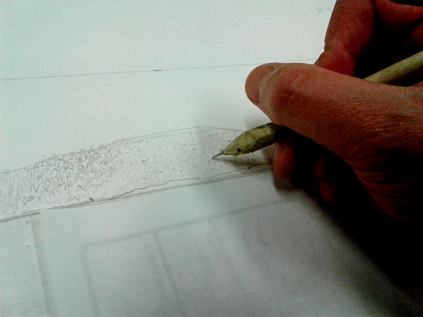
pencil sketch on hot press smooth surface paper board 


materials and tools I used to create the plate included: liquid mediums including glue, acrylic gels and pastes. Also dried plant bits and cut paper.


After the sketch was finalized on the board I went over the pencil with a fine point waterproof marker. Then I chose an area to begin cutting. My plan would utilize both subtractive and additive treatments to the surface. Subtractive (removing top layer) would yield a recessed area that would contain rougher surface enabling ink to collect and produce darker definition to that specific element of the image when the plate is printed. 
I brushed on a thin coat of water diluted acrylic glaze over the board surface and let it dry. This would help to make sure when I cut and removed areas through a subtractive process that the paper edges would remove cleanly without too much tearing occurring.
Using a surgical scalpel I cut a shallow line around one of the foreground islands. I then carefully gripped a corner of the cut area and peeled away the paper surface. These peeled areas in the background hills would be defined by a bit darker ink during the printing process. 
However for the hills and islands in front of these I wanted to have a bit more textural definition to show foliage.

For the distant islands and hills more to the front I created texture by using a sharp homemade etching needle where I scored into the exposed layer of paper board in small strokes to work up little linear elements that would recreate small coniferous trees (viewed from a distance.)


To help me see how the textural effect of roughing up the paper board was coming along with my finger I gently wiped a little powder from a dark red colour conte over the area. 


for the mid range hill terrain I stippled the board surface with the point of a proper etching needle. The needle tip created tiny pock marks that would hold ink and would differentiate scale of trees in a slightly smaller size compared to the island in front of it.

The next stage was to create an interesting sky. I really wasn't fond of the heavily clouded sky in the reference photo. Drawing on memory I decided to add in just a few fluffy cloud tops emerging from behind the distant hills plus a few traces of whispy cloud formation higher up. To create the fluffy clouds I used small bristle brush and acrylic gel medium. For the wispy clouds I used modelling paste and wiped it on with a finger tip.


I wiped a little dry powder from conte stick to reveal the texture of the clouds in the sky


The last area to focus on was foreground foliage. I decided a few select trees would be created by cutting into the board surface and peeling away surface layer. Some would be emerge from a collage of both dried plant materials, cut out paper shapes that could be glued on and finally some would be derived from addition of textural medium onto the board surface.


removal of the white smooth surface reveals rougher textured layer below. I then added in small areas of liquid acrylic medium to create small raised areas that will hopefully add a little pos/neg space effect in the trees.


using the smallest pair of scissors I cut out tiny little leaves from thin cereal box packaging for one of the foreground trees. These were glued onto the board surface.


I had a small box of dried plant fibers I had collected during walks. Some of these were adhered to the board with liquid acrylic gel to bond it to the board surface. I pressed down on the bits with a piece of plastic and held it for a minute to allow the adhesive to take hold.


In my next post I will be inking the plate and pulling my first working proof from it.