Sunday, August 28, 2016

Recent activity in the studio pt 1 - panoramic collagraph


Panoramic plate that will produce a printed image that measures 14 x 55 cm (5.5 x 21.5 inches.)
The plate has been sealed with several layers of clear shellac and now awaits the application of ink, wiping back and passing through the press.


It has been several months since my last post. I was away from home base for nearly an entire month. A few weeks back I was inspired to return to my studio and pursue an idea from several years back which was to create a collagraph print in large scale. 
To date the biggest collagraph from the studio has been (13 x 18 cm) or 5 x 7 inches.

I used a photo I had taken during a visit to the town of Marathon that is located along a section of the rugged shoreline of Lake Superior here in northwestern Ontario. I had spent 8 years of my life living here as a youngster. This region has some of the most dramatic terrain in Canada aside from the coasts that border all coasts of the country. It is also an area where a few members of Canada's famous group of seven artist collective journeyed farther north along Lake Superior from the Algoma region to paint depictions of this region and it's interior coastal areas. These included Lawren Harris, A.Y. Jackson and Frank Johnson.

Harbour in Marathon ON, Carden Cove to the right


Lawren Harris, 
Afternoon Sun, North Shore Lake Superior 
oil, 1924


Lawren Harris
Coldwell Bay, North of Lake Superior 
oil, 1923


Shoreline
A.Y. Jackson
oil
year unknown


A.Y. Jackson
Entrance to Pucasaw Bay
oil, 1930
Collection of Art Gallery of Algoma


My decision was to create a horizontal panoramic print constructed using a variety of media on a heavy paper-board surface. I happened to have a large rectangular frame (blond birch) in storage and this also helped to determine what the actual print image size would be.

pencil sketch on hot press smooth surface paper board 


materials and tools I used to create the plate included: liquid mediums including glue, acrylic gels and pastes. Also dried plant bits and cut paper.


After the sketch was finalized on the board I went over the pencil with a fine point waterproof marker. Then I chose an area to begin cutting. My plan would utilize both subtractive and additive treatments to the surface. Subtractive (removing top layer) would yield a recessed area that would contain rougher surface enabling ink to collect and produce darker definition to that specific element of the image when the plate is printed. 
I brushed on a thin coat of water diluted acrylic glaze over the board surface and let it dry. This would help to make sure when I cut and removed areas through a subtractive process that the paper edges would remove cleanly without too much tearing occurring.
Using a surgical scalpel I cut a shallow line around one of the foreground islands. I then carefully gripped a corner of the cut area and peeled away the paper surface. These peeled areas in the background hills would be defined by a bit darker ink during the printing process. 
However for the hills and islands in front of these I wanted to have a bit more textural definition to show foliage.

For the distant islands and hills more to the front I created texture by using a sharp homemade etching needle where I scored into the exposed layer of paper board in small strokes to work up little linear elements that would recreate small coniferous trees (viewed from a distance.)
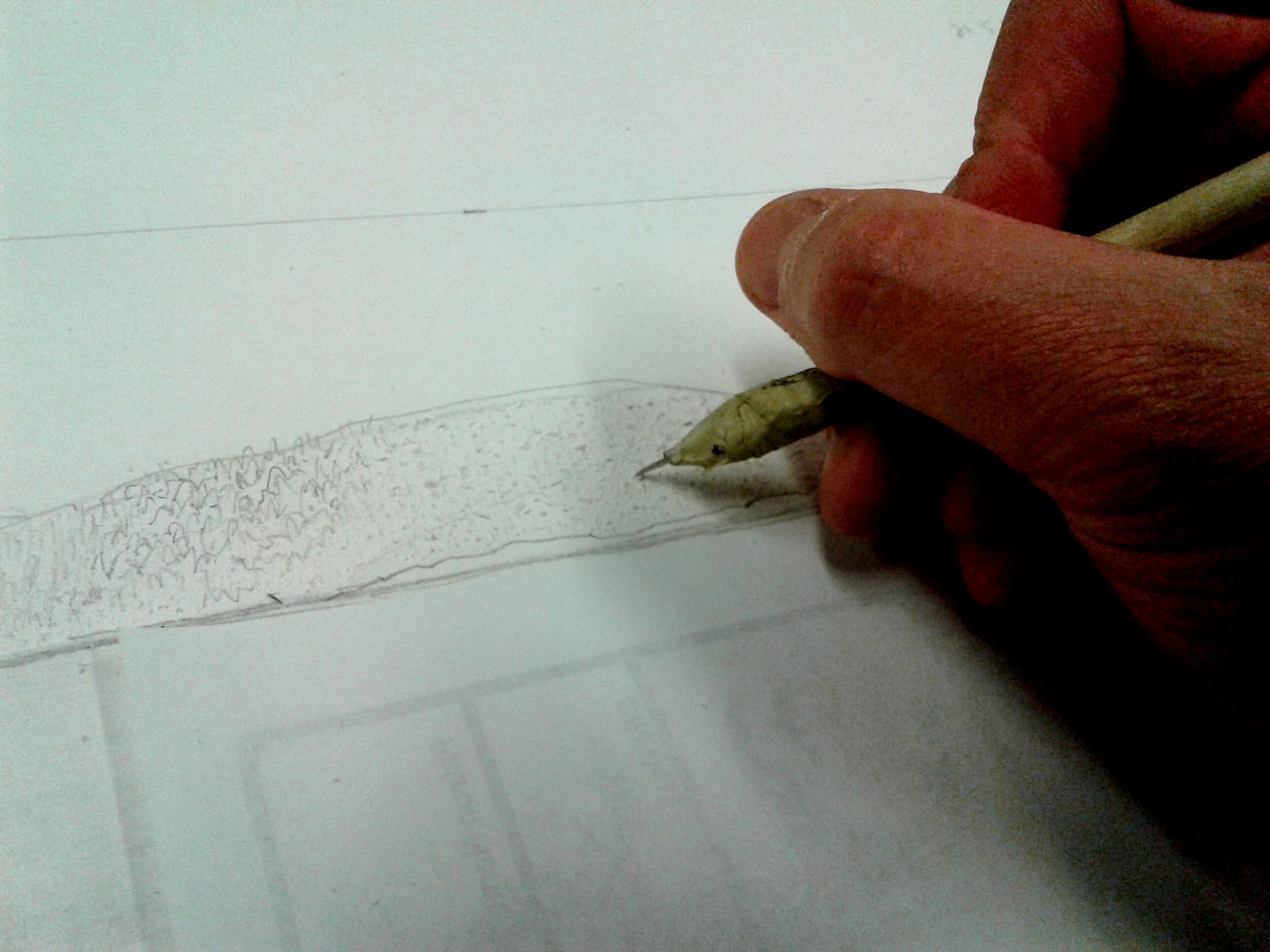


To help me see how the textural effect of roughing up the paper board was coming along with my finger I gently wiped a little powder from a dark red colour conte over the area. 


for the mid range hill terrain I stippled the board surface with the point of a proper etching needle. The needle tip created tiny pock marks that would hold ink and would differentiate scale of trees in a slightly smaller size compared to the island in front of it.

The next stage was to create an interesting sky. I really wasn't fond of the heavily clouded sky in the reference photo. Drawing on memory I decided to add in just a few fluffy cloud tops emerging from behind the distant hills plus a few traces of whispy cloud formation higher up. To create the fluffy clouds I used small bristle brush and acrylic gel medium. For the wispy clouds I used modelling paste and wiped it on with a finger tip.


I wiped a little dry powder from conte stick to reveal the texture of the clouds in the sky


The last area to focus on was foreground foliage. I decided a few select trees would be created by cutting into the board surface and peeling away surface layer. Some would be emerge from a collage of both dried plant materials, cut out paper shapes that could be glued on and finally some would be derived from addition of textural medium onto the board surface.


removal of the white smooth surface reveals rougher textured layer below. I then added in small areas of liquid acrylic medium to create small raised areas that will hopefully add a little pos/neg space effect in the trees.


using the smallest pair of scissors I cut out tiny little leaves from thin cereal box packaging for one of the foreground trees. These were glued onto the board surface.


I had a small box of dried plant fibers I had collected during walks. Some of these were adhered to the board with liquid acrylic gel to bond it to the board surface. I pressed down on the bits with a piece of plastic and held it for a minute to allow the adhesive to take hold.


In my next post I will be inking the plate and pulling my first working proof from it.


Sunday, May 1, 2016

miniature etchings from photopolymer plates - a how to photo tutorial

Sleeping Giant
I have been developing a series of small landscape studies that feature key locales along the shore of Lake Superior on the Canadian side of the great lake. The studies will all be the same in overall dimension size and all are horizontal. To date I have created plates for three studies. 
These are printed using a warm black Caligo safewash etching ink. Hand colouring is added to each once they have dried. No one single image off the same plate is therefore identical. 
I hope to have upwards eventually of up to 10 studies that will span locations all the way from Sault Ste. Marie Ontario west to Thunder Bay and then south down to the Minnesota border. 


Late afternoon kayak paddle - a Step by Step Photo Tutorial


The beginning stages of artwork being created on film of a new study that will feature the driftwood laden shoreline of Pukaskwa National Park and a small figure in a kayak in the water off the sandy beach. It started as a pencil sketch. I overlayed a sheet of clear wet media acetate film and added in details and textures using a refillable technical pen and then washes of tusche with brush.


 Duralar Wet media film


 Kayaker


I created the artwork and then scanned both the landscape and the kayaker at 600 dpi using a flatbed scanner on my inkjet printer unit. Once the images were imported into my photo-editing program (Corel Photopaint) I imported the saved kayaker scan and merged it into the landscape through a copy and paste application. I then saved the file. This was then resized (scaled down) to the dimensions of the polymer plate I planned to use (2 x 3.5 inches or 5 x 8 cm). I set the printer for grayscale printout and black ink only option. An A2 size of inkjet transparency sheet was placed into the paper drawer and the saved image was printed out. This served as my film positive which I exposed onto the light sensitive coated plate using UV lightsource. You can learn more about this process by visiting this post. 
http://www.myprintmakingjourney.blogspot.ca/2009/02/photopolymer-printmaking.html

The image was burned into the polymer surface by a chemical reaction to the UV and then I developed the plate using tepid water and scrubbing with an old toothbrush.  The plate was then exposed a second time to UV light to harden the polymer making the etch permanent.


positive with both landscape and kayaker on inkjet tranparency


below: developed plate with ink wiped into the etched image


detail of etch or pitted area of the plate surface. The duration of the exposure determines the depth of the etch. I also pre-expose the plate to a fine dot aquatint screen for 1 min before I expose the artwork positive. This creates a micro halftone dot pattern that will allow for tonal variations and also help keep the etch from becoming too deep.


ink application area of studio. Vegetable oil on the left for cleaning up. I also use detergent and water for cleaning off plates afterwards.


magnetic sheet to hold the stainless steel base plate steady when applying and wiping ink


tempered plate glass square which I use to mix my ink. 
Top left: rolled felt material with tape handle that I use to apply ink to the plate (dabber). Top right: ink spreader. Bottom left: wiping fabric (polyester interfacing) Bottom right: Caligo Safewash oil base ink - Carbon black and a tube containing a bit of caligo easywipe compound. I add a tiny amount of this to the oil ink to make it less tacky and spreadable.


small etching press with compressed polyester and styrene sheet bed. I place a paper template under the plexiglass which is the exact size of the paper the print will be made onto. I center the plate on template sheet and trace the outline in pencil. The inked plate can be set over top of this (as it is easily viewed through the clear acrylic sheet.) The white rectangle to the left in the photo is the cotton rag paper onto which a print will be made when it is registered with the template underneath and placed over top of the plate.


In lieu of soaking the cotton rag paper I spray it first on both sides with water. This is a little atomizer is repurposed from a throat spray. When the bottle was empty I cut a not into the plastic area that fit around the top of the glass bottle. This allowed me to remove it and set it back on the glass bottle. The little flip up wand is where the water is pumped into and it delivers a very fine spray when deployed.

after I mist the paper I quickly blot it between two pieces of newsprint. It is lightly surface dampened. As the polymer plate is quite thin I find that the inked plate won't distress the fibers of the paper as that of a thicker zinc plate might. I also don't worry about bevel of edges for the polymer plate either. I just run a burnishing tool along the outer edge of the plate to smooth any rough metal down.


setting the slightly dampened 250 gm cotton rag paper over top of the plate and lining it up with the template under the plexiglass top.


next step: I am placing a piece of newsprint over top of the cotton rag print paper


 lowering three layers of wool felts over the paper and plate.


The top roller is set to a fairly tight squeeze using the gauge levers (on top with the repurposed wine cork handle grips). I then pull the handles of the press (three spoke type of gear mechanism) and this propels the press bed forward and passes the plate, paper and blankets under the metal roller and out the opposite side.


lifting the felts on the opposite side once the bed has moved and the plate and paper have cleared the metal roller
making sure my hands are clean of any ink I then start lifting the print paper away from the plate.The moment of truth when the transferred image from  the plate appears embedded in the cotton rag print paper.


close up of the print on paper after it was removed from the press bed
 allowing prints to air dry...may take a while and then I will be able to apply colour to each through the introduction of wet media with brush
detail of kayaker from a print. The tiny dots in the water were created from the aquatint screen (tiny halftone dots) that the plate was pre-exposed to before the positive artwork.


Friday, April 1, 2016

Collagraph continued - small study from constructed plate


Here is a small collagraph I recently printed from a plate that I constructed back in 2012. The plate itself was 6 x 6 cm (2.5 inches). It was a simple composition created from application of collected dried plant tops and some other elements including scrap ends of fabric and paper. These were glued onto a small piece of matboard and then sealed under several layers of shellac.

I had made one monochromatic test print from this plate after the shellac coating had dried. Perhaps it was not inked properly but I remember the print off the plate was lacking in something so I put it aside and moved onto other artistic ventures.

Recently I pulled the plate out of storage and decided I would attempt to ink and make a print off of it. I applied oil based etching ink using small dabbers of rolled felt secured with duct tape. (these were about 4 inches in length) I left a little of the felt free of tape on both ends so it could be used to hold and transfer the ink. 
Here I applied a mix of  prussian blue, carbon black and cadmium yellow to create a seafoam green to the lower areas of the plate. I wiped the ink gently using a bundle of soft synthetic interfacing fabric. This was followed by a very light swipe of old telephone directory yellow pages.
For the small circular moon shape I removed ink using a cotton swab.
On the raised surfaces (plant elements) I rolled on a mix of carbon black and forest green ink using a small rubber brayer. Moistened cotton rag paper was set over top of the inked plate. This was passed under the roller of my small table top etching press.


resulting print on rag paper


I was quite happy with the resulting print this time around. 


The next thing I did was clean off the plate and press it into an equal size piece of thin dense styrne (styrofoam). This gave me an opposite image and the raised elements became below surface indentations. I inked the plate with the carbon black/forest green ink and rolled prussian blue and some cadmium red on the surface. Using gentle wiping I blended the two surface inks so that the top area became more of a violet hue.

original collagraph plate (left) and pressed foam plate version (right)


Again I placed dampened rag paper over top and ran it on the press bed under the roller.
Here is the resulting image that was transferred.


Sunday, January 24, 2016

Collagraph part II - using low relief dense foam

Shoreline
2007
Collagraph


In my previous post I showed a couple of prints of mine that combined various low relief materials to produce a print on paper. One of the materials that was used was low relief pieces of scratch foam printing plate. 

This material has the ability to embed other shapes into it's surface. It can be used to great effect for adding interesting details to a collagraph print.


I pressed medium grit sandpaper into the foam surface to give this a grainy texture. I followed this by stabbing the foam with a pen tip to give me slightly larger depressions. For some crack lines I drew across with the point of a bamboo skewer.
The objective here was to create a pocky hard rock surface which is very common to the region where I live. 
The mission with this collagraph was to convey a sense of the landscape and elements of Northern Ontario...lots of water with an abundance of Cambrian Shield rock interspersed with boreal forests.


I cut and glued down the foam pieces onto a thick paperboard substrate. Then using an xacto blade I cut away and shaped the material. Using a ballpoint pen tip I was able to press into the foam and create pockets for darker areas to be made when the ink would be applied.

I was able to coat the foam and rest of the materials on the plate using shellac. Once it was dry then thinned etching ink was applied to the plate and it was wiped back and printed.


This is a magnified detail from a section of a test print from another study (5 colour relief print) showing how the texture came about from the styrofoam.

Thursday, January 21, 2016

Collagraphs Part 1


collagraphs produced by Grade six classroom drying on cardboard drying board
St. Bernard Catholic Elementary School, Thunder Bay ON


I recently have been exploring collagraphs again in the classroom via my art teachings. I thought the idea of creating a low relief plate using additive and subtractive methods would stimulate and challenge students. They get to use recycled materials and also print their plates using my press.
It is also a lot of fun.
Due to time restrictions we couldn't use shellac or varnish to seal the plates. Instead we opted to spray the service with an aerosol adhesive (done outdoors with masks worn). Plastic food wrap was stretched over top and the plate was passed under the press roller set onto a light squeeze. This forced the plastic to mold over everything and also added some textural effect to the prints. Students wore barrier gloves to keep their hands clean and using Akua carbon black intaglio ink they loaded ink into recessed areas  using old toothbrushes and wiping ink on the surface with their finger tip. We used bunched up pieces of interfacing fabric for wiping back of the ink followed by a surface polishing using yellow pages and gift wrap tissue. Dampened cotton rag paper was placed over top and it was passed again through the press.


My introduction to collagraphs originates around 2008. I viewed a lot of work online of people who worked primarily in this printmaking technique and was extremely motivated. Not having ever tried this I researched the process from reading art instructionn books and by watching online demos in You Tube. Hestor Cox is a UK based artist who is quite proficient in the medium. http://www.hestercox.com/
Another person whose blog I follow is Southern California based artist Belinda Del Pesco. Her work is stellar. http://www.belindadelpesco.com/

The first couple of small plates I made using scrap packaging board and glue showed promise but were a little too simplistic. I became a bit more adventurous. I tried adding other materials such as mat board, thin sheet styrofoam, modelling gel medium and liquid PVC glue, sandpaper, bamboo, scrap packaging card, dried organic materials like cedar needles, dried flowers added to surfaces. I also removed some areas of the base mat paper board using kraft blades. These areas would hold ink and allow for darker tones in a print. From all of this two plates emerged and the resulting prints were quite satisfactory.

One of these become a monochromatic piece that I included in an exhibition series titled Wilderness. It is a study of a stream meeting a low rise rock face and percolating down through a narrow cut in cambrian shield rock.


Passage
2008
collagraph (monochrome)


It is one thing to see the relief built on the base card but you won't know how this is going to turn out until you actually ink the plate and print it.
I still have the original plate for this study and I am tempted to print a few more by either inking the plate A la poupée (spot inking in various colours of inks) or applying hand colouring with wet media to the black & white print.


Shoreline (pictured below) was a study of a section of pond I observed during one of my nature hikes. The foreground rocks were created by cutting and gluing thin foam sheets to the base plate. I pock marked it and then pressed in fine grit sandpaper to create textural elements into the rock. The cat tails were created using shavings off bamboo skewers and liquid bead of PVC glue. The background was dried fern ends, cedar needles and gel medium applied with a small brush tip. The dark water was created by cutting and peeling off a thin layer of the mat board. I then added some fine lines of gel medium into the recessed area. These were in reverse of the built up cat tail stalks and would create a reflection effect when the plate was inked, wiped and printed. The plate had several layers of Shellac sponged rolled over top to seal and waterproof it.


Shoreline
2010
collagraph (monochrome)