Thursday, March 25, 2010

Home art studio solutions for small spaces

Here is my print studio in a low ceiling poorly lit basement
I am considering buying and assembling a prefab satellite structure that could be housed in the back yard 

Some of my artist friends are part of studio tours here and in other communities where they live and work. They have been fortunate to have spaces in their homes where they can have people come by and see them working on their art and also have a display of work on the walls for viewing. I have not been so fortunate to date with my own set up.
My partner and I live in a fairly old 1-1/2 story small house (it will be the grand old age of 100 in a couple of years) and since we have lived in it (14 years now) and has been undergoing updating in small increments as time and money will allow.
I have a small number of my art work in frames and hung on walls but they are scattered around the house. Some are not even really accessible to guests for viewing. So I have had to decline invitations to participate in studio tours to date. To be honest I am even embarrassed to have other artists see my printing studio...so I avoid showing it at all costs...until now that is (see photo above).
Anyhow I have been seriously thinking of late about trying to find space here at my home where I can  have a prep area to work on designs but also have my printing area close by and a wall or two for gallery, in other words an all in one studio space. At present I have three seperate areas in the home I use. The large pine table in my dining nook (which provides wonderful natural light as it has 2 walls with windows) and is where I create drawings, do my block cutting and engraving, etc... I have another room (office/library) where we have our Dell pc and Epson printer/scanner. This is the room where I do photo editing, scanning of artwork and printing of transparencies.
Finally there is the printing area. This is an area in my basement that has a low ceiling (6 ft of overhead clearance...one has to duck under the main support beam when they are navigating around). It is a bit dark down here, it is not finished and can be damp in the warmer weather (not so great for an etching press). There is a dehumidifier that helps during the year when the gas furnace isn't running, plus have rigged up several daylight compact flourescent lights around my printing table and press, but....things could be better. Given that my health is getting more fragile as I age (especially with things like air quality and mold, dust allergies) it would be nice to be in a place where I can breath healthy, have natural light to work by and be able to have a work desk in one corner, my press and printing bench in another and also some area with organized shelving for paper, inks and tool storage.
Given that I do not have any other options inside of my home for a proper studio I may have stumbled across a possible solution.
One of these is something that caught me eye by accident while doing a Goggle search on art studios. It is called a Modern Shed. Given that there is a bit of free area in my backyard this just might be the solution I am looking for.
In the third and fourth photos posted below is an interior of one the sheds. I like the angled ceiling idea with the bit of light allowed in at the front at the top in addition to that from the windows. This structure for my own use would definitely have to be insulated given the area of the world where I live and would have to figure out a way to keep it heated in the winter (solar, small gas fireplace or wood burning stove?) and have a source of electricity (solar panel mounted on top or nearby perhaps or something immediate such as running an extension cable from my house plugged into an outside outlet?).
As an artist/printmaker who uses a lot of water soluble or water based mediums (enviro friendly non- toxic thankfully) I would most likely have to construct some form of washing up area (perhaps an acrylic laundry tub that could drain into a pail underneath). I really don't want to have to worry about complicated plumbing installation so I would try and devise a practical solution for this.
Then there would be security. Maybe an alarm system that could be powered off the solar battery? Luckily I have good neighbours close by who also are around a good deal of the time so that helps.


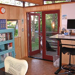


I also did a bit of Goggle searches and found other small structures (some prefab) which might work too.


This is an interior shot of a structure made by a company called Modern Cabana


and a company here in Canada manufacture perfab spaces such as this little beauty

Wednesday, March 3, 2010

Adventures with Monotypes

I have been a little under the weather the past couple of weeks battling a rather nasty virus which had me finally resort to getting a prescription for an antibiotic. Although I prefer to treat ailments using homeopathy or naturopathic medicine, in this case neither was really helping to defeat this virus so hopefully the prescription will do the job?
Needless to say my energy level has been running at about 50% and also suffering with sore achy body. However have managed to at least create something that doesn't require a great amount of physical labour (as say carving a lino surface). I was able to achieve a couple of studies created using a type of printmaking that produces a one off image.


Below are two examples of painterly printmaking. Both are Monotypes.


The first pictured above was created by first sanding the surface on one side of a piece of thin plexiglass plate lightly using a fine grit sanding sponge. I then coated this surface with a thin layer of diluted dishsoap solution and allowed it to dry. Then applied pure watercolour pigment straight out of a tube using brush. You can also use water colour crayons or pencils.
This was allowed to dry. Using masking tape I hinged a piece of Masa paper to the edge of a an equal size piece of paper (the registration sheet) and then centered the plate and drew a pencil line around the edges to mark it's position. A fine mist of water was sprayed over the paper and then I folded it over to cover the plate. The moisture on the paper will reactivate the watercolour pigment which will probably have dried before being printed. Using the back of a metal spoon I used hand burnishing to transfer the reactivated watercolour onto the underside of the paper.


I then folded back the paper and removed the plate which I washed clean and repeated the process with coating the plate with the diluted dishsoap and applying a new layer of watercolour. The plate was again set into the pencil outline on the registration sheet and printed again using hand burnishing. I repeated this several times to build up a series of layers of colours.
The print is a bit organic in it's composition and the layering of colours created some interesting effects.


 This is the plexiglass plate with the final colour (dark indigo) painted on the surface.


This is my second study and is a that uses a process of removing ink.
It was created by first coating a piece of plexiglass using a brayer coated with a thin layer of oil based black relief printing ink. Ink was removed from the surface of the plate (here is where the subtractive comes into play) using a variety of tools that included the pointed end of an old paint brush, q-tips, wood toothpicks and my finger tip with small bit of tissue wrapped around it.


The plate was printed onto damp Somerset paper. The plate was first set onto a sheet of white bristol board which had the plate outline marked in pencil in the center and cross marks in pencil to indicate where the corners of the printing paper should align. This was set on the press bed with the inked side of the plate face up. The paper was placed on top, then a piece of newsprint and finally three layers of wool felt blankets over top of everything. The entire works were then passed under the roller of the etching press and transferred the image to the paper underneath. This is the same routine you would use to print an intaglio etching althought not as much pressure is required. My plexiglass was thin enough that I didn't have to worry about bevelling the edges ahead of printing, If it were a little thicker then I would file a bevel so that both the print paper and blankets do not get damaged from the edges of the plate under the pressure of the roller.


The inked plate with details created by removing ink using a variety of tools.

Thursday, January 28, 2010

New prints - Water in the Wilderness:Northwestern Ontario


Quetico/French Lake
colour block print
2009


Posted below are a few photos that show some of the new work from my series titled Water in the Wilderness:Northwestern Ontario on display at Gallery Stratford
I addition there are several other prints from this series featured in a few of my previous blog posts


Artist Statement

We are living in a time of great concern with regards to the welfare of our planet.
Forces of change are occurring that are playing a major role in factors that affect the natural world and ultimately its survival. One important area of concern is water.
Water is of great importance as a basic element that provides sustenance for all life.
In nature it provides a source of nourishment and habitat for aquatic based life such as insects, fish, bird and animal life. It carries nutrients, minerals and the seeds of life in its flow. It is instrumental in shaping and defining the landscape through its own natural processes.

Water is also a common theme in many of the works I produce as a visual artist.
This connection may be due to the influence of having lived a good majority of my life along the shores of Lake Superior, the largest body of fresh water in the world. The region also contains vast areas of boreal forest that encompass a large number of fresh water rivers, streams, lakes, ponds and marshes. There is an incredible biodiversity that exists in Northwestern Ontario that is accented by an array of unique species of flora and fauna. All are dependent for their survival on a continuous supply of life sustaining fresh water.

I have had the good fortune to observe this relationship first hand during journeys by canoe to remote wilderness locations that use numerous river systems and portages between lakes. I have hiked on foot through the woods and followed along or directly through streams and shores and waters of lakes or ponds to reach interesting remote destinations. Many of these have been recorded and stored on my camera, which I use as a means of acquiring source material. This collected photo imagery often serves as reference material that is used as the basis for my work. The basic composition that I derive from a photo is then translated to an artistic study using a variety of traditional and modern printmaking disciplines. As that image develops either above or below the surface of a particular matrix it frequently takes on a life of its own. I will focus on a particular area or point of interest in the work where a fair amount of time is spent placing emphasis on details in the image.

The intention with this series of work is to relay some of my personal observations that examine the influence of fresh water in the realm of the natural world is it exists in the wild. I have a fascination not only with landscape which is a prominent component in many of my images, but also with the structures and forms that are found in the many varieties of organic life. With this series I have chosen to illustrate the important interconnectedness that exists between the landscape, living things and the element of water. I present these studies in the form of a visual diary that capture my experiences as individual moments that reflect a particular time and place. As forces of change proceed to alter these habitats and ecosystems these studies might serve as a record for future generations.
.
The images are derived from a variety of surfaces that employ several types of printmaking techniques. These include serigraphy, relief block, collagraph plate, intaglio plate and photopolymer gravure. It doesn’t matter what discipline is employed, for each one will present a set of challenges that force me to think about, learn from and ultimately expand my levels of skill and expertise in that particular medium.
Some of the images have incorporated the combination of media such as the addition of watercolour applied through hand colouring. The computer has also been used as a tool for creating positives in the photo polymer process and also printing of opaque positives that have been exposed onto photo-emulsion coated surfaces that were used in several of the serigraph studies on paper. Polymer plates are a more recent development that allow one to marry new technology with traditional printing processes in a safe non-toxic manner
.


solitude
colour relief reduction block
2008


Superior shoreline - west towards Rossport
series II
various relief surface block print
2009


Pool
polymer plate photogravure with hand colour
2008


Young Deer Kamanisitiquia River
engraving
2008
Habitat
polymer plate photogravure / hand colour
2009

Wednesday, January 20, 2010

Water Mark - Gallery Stratford Jan 17 - Apr 4, 2010


My series titled Water in the Wilderness - a series of 25 hand printed images on paper


I recently returned from Stratford, Ontario where I attended the opening of Water Mark at Gallery Stratford. My series of 25 images on paper collectively titled Water in the Wilderness were created using a variety of printmaking disciplines and are part of this trio exhibition .


Also of note, the new works are featured in my brand new website which launched this week to coincide with the exhibition. You can view the Water in the Wilderness series as well as some older works still available for sale by clicking the following link: http://www.brianholden.ca/.

There is a link in the site to archives where you can view older artwork that was created using other mediums in addition to printmaking.


Gallery Stratford on Romeo St. in Stratford, Ontario. It was once a water pump house.


Besides being present for the docent walk through I also gave an address about my work to those in attendance during the opening on Sunday Jan 17.


The show also features a series of over 45 various size wood engravings by Stratford printmaker Gerard Brender a Brandis and a series of 12 aquatic theme monoprints by another Stratford based artist, Lucinda Jones.


Special thanks to Gallery Stratford staff and Carla Garnet, the guest curator who worked with the artists and facilitated the decision making for presentation of the work.
I also wish to acknowledge the assitance of the Ontario Arts Council. The Ontario Arts Council is an agency of the Government of Ontario.


left to right: Gerard Brender a Brandis, Carla Garnet, Lucinda Jones,myself and Zhe Gu Director of Gallery Stratford.


Opening reception for Water Mark on Sunday January 17, 2010.


Educational display case for Lucinda Jones


Educational display case for Gerard Brender a Brandis

Educational display for Brian Holden

The artists were also asked by the curator to supply materials for an education display showing tools, surfaces and source sketches and photo material used in the creation of our printmaking.


Finally....here is a looped video that was filmed on site as it appears playing on the montior in the gallery and is another component of our trio showcase.

It is composed of four short video clips, the first and last clips by yours truly and the middle two clips provided by Lucinda Jones. My segments were recorded last fall and originate from two remote Northwestern Ontario locations. This video display has been included as additional source material along with the items each of us provided for the display cases.


Thursday, November 19, 2009

demo relief print made from Styrofoam - jigsaw block technique


Take out
styrofoam jigsaw relief print on black paper


I will be starting a project on Monday working with about 20 elementary school students (range of grade levels from four through eight). They will be creating individual relief based prints from the surface of a product called scratchfoam. The students will be learning a technique called jigsaw block. They first draw an image into the surface of the foam using ballpoint pen. Then waterbased ink is rolled onto the print surface using a rubber brayer and printed using a hand burnishing application onto a piece of paper that is set over top.

The foam is first bonded to a thin piece of bristol board using a high tack spray adhesive. The bristol board has a thin layer of water based varathane rolled on the bottom side to help waterproof it and to counter act the tension of the two materials brought together. This prevents it from curling when it is cut apart or when ink is applied to the surface. This sandwich thickness is still pretty easy to cut using scissors.

The next step is to dissect the block which will allow it to be printing using a jigsaw technique.
I carefully cut the block apart using scissors and xacto blades. The trick was to follow lines already drawn into the foam and use these as a cutting guide .


I devised a registration board system so that a 9 x 12 inch piece of scratchfoam was reduced to a 7 x 10 inch block. This left 1 inch strips of scratchfoam which were set along the edge of a 9 x 12 foamcore registration board and held in place with masking tape. The inked pieces were reassembled back into this frame. Each of the 7 individual segments had a colour of ink rolled on and were then reassembled A 9 x 12 piece of black paper was placed over the block and held in place with push pins at top. The placement of the block contained within the one inch strips along the perimeter helped to center the block on the paper and left a one inch border around the image on the paper.

I found that Speedball ink has a tendency to dry quickly (even with retarder medium added) so had apply a spray of very fine water mist to reactivate it just before the paper was set over top and hand burnished.I usually spray about 15 - 20 inches above the block and let the mist settle gently and evenly on the surface. Unfortunately a little bit more water collected and caused a little uneveness in the light blue section under the crow and to the left side of the trash can. Anyhow those that work with Speedball might understand some of the challenges it presents.

I chose black paper as it provides the dark contrast to define the line in a positive image. If this was printed onto white paper then you would get a neg. image.The students should have some fun with this testing their skills in composition, colour application and exploration of shape, line, texture to name but a few key learning factors.

Another thing I have learned is that some of the Speedball inks such as yellow, red and blue do not print as opaque on a black background so by adding just a hint of white ink will help to increase the opacity. But in some cases the transparency factor can be used for effect (for example a pure yellow was printed on to the black paper in the grass section at the bottom of this image and produced a tint of green).

If I were to do an edition of prints from the foam block for my own collection (which I may still) would most likely would use an oil based ink and print these on a better quality of printmaking paper that is available in black such as Stonehenge, Somerset or Canson paper.

Saturday, November 14, 2009

A combination of relief and intaglio


This new print was born from the combination of two techniques and used one linoleum block. It is a study of the patterns found on the surface of water (in a bit of an abstract presentation). Basically what I did was wipe and force a water soluble oil ink (prussian blue) into the cut recesses of the block. The flat surface relief had a layer of light cerulean blue linseed oil ink rolled onto the surface with a brayer.

I soaked a piece of heavier white cotton rag paper and then blotted it between an old cotton towel. Setting my top roller for moderate pressure on the etching press I put felt blankets and newsprint overtop of the print paper (which was set on top of the block) and ran it under the roller. This pushed the damp paper down into the recessed areas and also picked up the ink from the surface. Some of the deepest areas of cutting did not get ink into them so they printed as slivers of white which add to the play of light on the surface of the water.

Tuesday, November 10, 2009

adventurous photopolymer prints


Superior - A reflection
photopolymer gravure/hand colouring
2009
image size 12.7 x 17.8 cm, paper 25.5 x 30.5 cm
variable edition of 50


The Stream of Consciousness
photopolymer gravure / hand colouring
2009
Image size 12.7 x 17.8 cm, paper 25.5 x 30.5 cm
Variable edition of 50


Some recent explorations with interesting results created by crossing media.
Both prints are both derived from photos I have taken. They have been interpreted as prints by exposing the positives made from the photos onto photopolymer plates and printed as gravure impressions in paper using an etching press .

The application of watercolour into both helps to expand each image from the state of a single colour impression and makes each come to life in it's own unique way.
Superior - A reflection remains fairly close to the original photo in it's colour values. I was very fortunate a couple of years back to have come across a pool of water on the shore of Lake Superior which I thought actually resembled this great lake in terms of it's shape (when one looks on a globe or in an atlas). The reflection of the fir tree and branches plus the sky and the few loose leaves floating on the surface add to the overall impact.
This same image started off as a photopolymer gravure study but in a much smaller square format last year. It was created then as a contribution I made to a miniature print exhibiton sponsered by Graphik Vaerstad Print studio in Naestved Denmark. I found the imagery rather fitting for the fresh water connection and so have scaled up and approached it with a slightly different colour palette this time around.
.
The Stream of Consciousness approaches the presentation of image from a slightly more abstract perspective. I have applied an interferance copper wash over the print (blocked out the white areas using liquid frisket) and then more washes of cerulean and indigo, serpentine green and a hint of cadmium orange on top of each other. The frisket was carefully removed with a rubber cement eraser to reveal the white of the paper. The metallic effect of the interferance wash is evident when the print is viewed in certain light and from particular angles. It reminds me of some of those beautiful glazing effects sometimes one finds on dark colour pottery.

Both of the studies are part of a series of work that explore fresh water and it's relationship to me. It is my intention that they will be on display along with 22 other studies I have produced for a trio exhibtion that focuses on this theme in a display of printed images on paper taking place at Gallery Stratford in January 2010. The show is titled Watermark.

I apologize for the copyright text emblazened across the bottom of each image. Unfortunately I have not yet been able to find a right click disable option in the blog applications so in order to protect unauthorized duplication of my images I must resort to this for the time being.

Tuesday, October 20, 2009

Collagraph - collage plate print


I am currently working a small series of collagraph prints which are a combination of intaglio and relief printing surfaces.

The untitled work pictured above represents streams of water, one passing through a channel in rock and the other flowing over a ledge.

I may apply a bit of hand tinting to one of the proofs to see how the image might be affected. Another option is to dab small areas of colour ink to the plate using an a la poupée technique where ink is dabbed on with tiny bundles of cloth and selectively wiped. Poupée comes from the french word for dollies or dauber.

The base plate is a piece of tagboard to which I have applied glue and affixed elements such as thin pieces of scratchfoam (styrofoam product), living organic materials such as grasses and conifer needles, more cardboard and the odd scrap of fabric. Then acrylic based modeling paste was added using a brush and worked with the brush tip to create interesting textures. The rule of thumb is that anything with a low relief (and will not damage your roller) can be attached to the plate which is then sealed with varnish.

Here I have worked into the styrofoam with a needle and also by pressing coarse grit sandpaper and burnishing it to leave impression marks in the styrofoam surface to replicate the pocky texture found in igneous rock that is commonly found in the region where I reside.


Ink is applied and wiped into the lower recessed areas and also applied using a roller to the surface relief areas.

In this particular image I have applied one colour of oil based ink that coated the entire plate and then I carefully wiped away off surfaces using tarlatan (starched cheesecloth), tissue and old phone book pages.

I soaked a piece of 250 gsm rag printmaking paper for about 20 min. in lukewarm water then blotted it between pieces of newsprint and tissue until it was ever so slighty damp to the touch. The plate was set onto my etching press bed, the paper placed over top and then two layers of wool felts over that. It was passed under the rollers using a fairly tight squeeze (as the plate is a bit higher it doesn't require the same amount of pressure as that of metal plate etching).

Liking how the ink deposits into the recesses and with selective wiping creates a look similar to an etching with aquatint.


Friday, October 16, 2009

Water pool - along Superior (Solar plate print)

Water Pool - along Superior
solar plate print with hand colouring
Image size 5 x 7 in. (12 x 18 cm)
paper size 8 x 10 in. (20 x 25 cm)
variable edition of 24


I used one of my photos as reference to draw a rough which led to the creation of the print.


Pictured above is the second stage on frosted drafting film from original sketch done in pen and ink and fine point marker with washes applied using thinned down india ink. The first rough sketch in pencil on paper was placed underneath the drafting film and was used as a guide to apply the washes first. Once these were dry I then added in the linework and dots with pen and ink. This was then scanned at 600 d.p.i. on my scanner and printed in grayscale onto an inkjet transparency.
Exposed the transparency onto a 5 x 7 inch solar plate using the double exposure method, first stage being the aquatint screen exposure followed by the grayscale positive. The aquatint screen acts like a halftone to pick up the lighter elements in gray from the image so as not to get a high contrast effect.

Printed on Canson Edition 250 gsm off white with Graphic Chemical Bone black ink. Colour was added using washes of watercolour.

Saturday, October 10, 2009

Elementary School Art - Collagraph prints from Nature

untitled
collagraph print
water based ink on rag paper
plate size 20 x 25 cm (8 x 10 inches)


I recently was contacted by a Gr. 5 elementary school teacher in Thunder Bay expressing interest in having me come and undertake a printmaking based project with his class.

This is for a program called Artists in the Fifth. This program has been up and running for the past few years where grade five students and their teachers in regional schools choose to bring in actual working artists (visual, musicians, dance and movement, writers,etc..) to the classroom and the children work directly with us on unique and exciting projects designed around particular themes. The results of these projects are then presented to the local community in a one day showcase called An Arts Fiesta which takes place every Feb. at our local community auditorium. The participating schools with the students and teachers are in attendance as are the artists who have come into their classes. In addition the public and local media are invited to come and participate.

The visual art creations are displayed on panels or hung on the walls while music, spoken word and movement pieces are performed on stage.
The theme this year for the program is Design by Nature.

The class I will be working with decided they would like to explore collagraph printmaking and so I decided to create an example print that illustrates what can be achieved.

For this particular study I incorporated natural materials found in nature such as leaves, blades of grass, conifer needles. These were adhered to a thin paper plate with PVC glue. I also added in some background texture to the plate by working a thin layer of acrylic gel medium in with a paint brush. When everything was dry and the gel had hardened I coated both sides of the plate with acrylic latex house paint. This helps to seal and waterproof and keep the tension equal on both sides of the plate.


I then applied waterbase printing ink to the plate surface by painting it on with a brush, dabbing it into recesses with sponge foam brush or small bundles of material. The ink was then wiped with rags or worked with my fingers until I felt it had reached a point where it was ready to print onto paper.
As the waterbase ink was starting to dry I applied a fine mist of water spray to the plate surface and also to the one side of the paper which was then set over top of the plate. Both plate and paper were set on the bed of an etching press and a rubber blanket was placed over top of the plate/paper. I passed the works under the roller of the press (it was set for a bit of a squeeze) but not as much pressure as one would require to print a etched thin metal plate.

Notice how the combination of pressure and ink picks up the fine structures found in each object especially the leaves and the cedar needles. This is a direct example of designs created by Nature as they are observed in the actual materials used. I have taken the natural components and arranged them in such a way to teach the students about composition, colour, texture and
the like.