Tuesday, January 25, 2011

Elementary School printmaking instruction

I have been active the past month in the role as an arts educator visiting grade five classes in a couple of elementary school classrooms here in the city of Thunder Bay.
This is through the Community Arts and Heritage Education Project or CAHEP. I have been actively getting placements in schools through this program since 2006.
This year the learners have been given the opportunity to learn relief block printmaking. Not only do they get to try a brand new visual arts technique but learn about the principles of design and explore colour theory in the process. This years theme for the program is Thinking Outside the Box.
Here is the Project Overview for the second and most recent venture:

Project Title: Construction

This project uses relief block printmaking as the basis for the creation of hand printed imagery that utilizes several stages of process from start to finish.
Learners were given the opportunity to use two surfaces to create a two colour print on paper.
One surface was left solid and the second surface was carved into using special cutting blades to produce a relief design. Prints were produced by using careful registration of paper and application of ink to both sides of a block in two separate printing sessions.
To begin, the learners were encouraged to think about and share dialogue revolving around the concept of the word structure. Using photo reference they focused on a particular section of either a manmade or nature made structure. They enlarged the chosen area and proceeded to develop it and construct a colour print that would allow it to be viewed in an entirely different way.
This is where adhering to the theme of “thinking outside of the box” came into play.
Learners were also challenged by utilizing the principles of design in their respective works of art. During the project they learned about such important areas such as line, shape, positive and negative space, rhythm, repetition, texture, composition, contrast to name but a few.
Using linoleum cutting tools they were able to carve their images into a soft composite material (softoleum).  Ink was applied to the relief surfaces using brayers and prints were made in two colour combinations on paper using traditional hand printing methods.
An emphasis was made on using complementary and split complementary colour combinations in the prints that would allow for real contrasts and impact in the images.
The students printed a solid colour square first and then the cut side of the block with their design was printed over top in a contrasting colour.

Materials used:
Softoleum blocks, linocutting tools, water based printing inks, soft rubber brayers, registration
boards, subi printmaking paper, rubbing sticks, spray adhesive, white foamcore board panels, spray adhesive

Individual panels contain 6 prints are stacked vertically with an overall measurement 25.4 cm (10 inches) in width by 101.6 cm (40 inches in height).
Each image explores the concept of structure in two colours.

The finished results have been very good. I have put together a display module where an equal number of prints (6) are affixed to a foamboard panel in a vertical format. Four of the panels will be hinged together into a four sided column and set on a table to allow for 360 degree viewing.
The results of these sessions will be presented to the public in a day in Feb. at a Community based Arts Fiesta held annually in our local auditorium. Then the works will continue as a display in a public space such as an art gallery or other public accesible space for a longer duration through the month of March.
Below are some photos that were taken during different stages of the projects.

cutting the softoleum using linocutters
 reference for the drawing on the block is from a colour rough sketch

water based Speedball inks applied to the block using a rubber brayer
that was rolled out onto brayer from plate glass surface


registration of block on simple cardboard with foamboard strip taped on top.
The paper is held in place with push pins and the paper is set over the inked block
and burnished using a plastic rubbing stick using constant pressure in a circular motion.


back to back prints hung to dry on a clothes line.
One of several stations set up for application of different colours of inks to the blocks.


zig zag design - orange printed over top of a solid violet square

detail from square print panel - spiral shell design printed in green over red (complementary colours)


another detail from a print panel
spider web study - yellow over top of a solid red square

four panels each with six prints that will be hinged together to create a four sided column display 
Each  print is 14 x 14.6 cm (5.5 x 5.75 inches) and there are a total of 24 prints in total. 
.

Monday, January 24, 2011

Overcoming problems in relief printmaking when using water based inks

Recently in the printmaking forum at WetCanvas some artists new to relief printing posted inquiries about problems they had been experiencing. I thought it might be good to share in my blog some of the advice that was given so anyone who might read this journal entry could also use this information to help them.

There seem to be a lot of problems printers experience while working with water soluble inks that are pigment based bound together with gum arabic. I am talking primarily with some brands under names such as Speedball, Daler-Rowley, Ocaldo, Demco (Canadian made). These types of ink can dry very quickly on the inking slab, brayer, block surface if the enviromental conditions are too extreme caused by heat or direct sunlight. Another problem is working with them when the temperature is too cold as they will not behave the way they should for application. The ink will sometimes not grip the brayer surface or apply well to the block surface either.
If it is warm and dry where you are doing your printing you could add a small amount of retarder to your ink. Speedball manufacture such a product and also they make a clear medium extender.
As for working in the cold, your best bet is to print in a space at room temperature.
You may want to make sure that your brayer (roller) is totally free of any residue from past use (especially if it may have seen oil based inks used on it). Water soluble ink picks up best on a clean smooth surface. I personally tend to favor using a soft rubber brayer but to each his own.

Another factor may be the surface of the block itself. Is there any residues on the surface that could act as a resist against water soluble inks?
Might try wiping with soft cotton cloth and denatured alcohol or you could also lightly sand the surface of the block using an extra fine grit paper or sanding sponge.

The ink should be rolled out on your glass into a thin even mass and picked up by the brayer again to allow a thin even coating on your block surface. Ink application is best achieved by rolling it in different directions across the surface. You can tell if there is a even shine across the entire surface but also you shouldn't see marks where heavier and lighter ink layers overlap.

Paper is another important factor to consider. If you are applying hand burnishing to transfer the ink to the paper you want an absorbant paper surface but also the paper should not be too thick.

Here is a list of lighter weight papers that are suitable for printmaking and I have provided links to some of the major retailers online who sell these. GSM refers to the weight of the paper in grams squared). Generally anything higher than 200 gsm might require the use of a press to give you the best results due to the thickness of the paper. The ones listed shouldn't require a great deal of hand pressure. These are also suitable for oil based relief printing off a block surface including those using linoluem, wood, resingrave, styrofoam, softoluem, easykut, speedykut, plaster relief, etc...

Magnani Revere book weight (175 & 120 gsm)
http://www.danielsmith.com/Item--i-G-540-610

Canson Johannot book weight (120 gsm)
http://www.dickblick.com/products/ca...not-art-paper/

Zerkall Frankfurt (120 gsm)
http://www.dickblick.com/products/frankfurt-paper/

St. Armand old master (80 gsm)
this mill based in Montreal makes paper in the old world tradition and although I have never tried their Old master drawing paper it is recommended for letterpress and judging by the weight would lend itself to relief printing I suspect?
http://www.st-armand.com/English/E02d-Drawing.php

Arches Text weight (120 gsm)
https://www.graphicchemical.com/shop...t=Arches+Text+

Somerset text weight (120 gsm)
https://www.graphicchemical.com/shop...et+Text+L aid

Zerkall book vellum (145 gsm)
https://www.graphicchemical.com/shop...catalogid=3697

Zerkall Nideggen (120 gsm)
https://www.graphicchemical.com/shop...9&cat=Nideggen

Somerset book (175 gsm)
https://www.graphicchemical.com/shop...=Somerset+Book

Gutenberg (various weights)
https://www.graphicchemical.com/shop...&cat=Gutenberg

Arturo (!20 gsm)
https://www.graphicchemical.com/shop...309&cat=Arturo

Rives Lightweight Paper 115 gsm
http://www.danielsmith.com/Item--i-G-285-620LW

Mohawk Superfine 120 gsm
http://www.danielsmith.com/Item--i-G-215-010

Velin Arches (Arches text weight) 120 gsm
http://www.danielsmith.com/Item--i-159-390-001

Hosho
http://www.dickblick.com/products/hosho-paper/

Mulberry
http://www.dickblick.com/products/bl...rinting-packs/

Masa (77 gsm)
https://www.graphicchemical.com/shop...d=351&cat=Masa

Kitikata (30 gsm)
https://www.graphicchemical.com/shop...4&cat=Kitakata

I will also mention a retailer based in Toronto Canada who have a fairly extensive array of Oriental made papers worth checking out. The Paper Place on Queen St. W are one of the best sources here in Canada I have found. I believe they also ship worldwide.

Another thing to try is a slight misting of the paper before burnishing. Not too much though since you don't want bleeding of the ink to occur. The slight dampness of the paper surface can also aid a better pick up of the ink onto the paper.
When burnishing the back of your print paper you might want to place a sheet of wax paper, acetate or glassine in between the burnishing tool and the paper. This helps to prevent possible damage to the print paper and also helps the movement of the burnishing tool across the block surface located underneath the print paper.

Wednesday, December 22, 2010

some older works not posted before

I have been going through the print drawers and digging out some work to build up the offerings in my Etsy shop. So thought I would post these as a new entry in my blog.
Speaking of Etsy, I was asked recently to join Printsy, a collective of printmakers who feature their works in that site. It is an honour to be included so thank you to those who extended the invitation. There is some stellar printmaking by these artists featured both in the Printsy blog and in their individual Etsy shops.


This is a blind embossing that is titled Concentric. The relief plate was constructed from precut shapes of 4 mm thick Eskaboard  that was glued to a base sheet. I then coated it with a couple of layers of varnish and set it aside overnight to dry. A piece of Somerset 250 gm rag paper was soaked and blotted then set over the constructed plate. It was pressed into the paper under the pressure of my etching press roller. It was then set under blotting sheets with the slight weight of a panel set over top and allowed to dry.
I have a basic white cut mat around the impression (same white as the rag paper) and set this into a square birch shadowbox frame.


The study below is a drypoint titled The Park printed using Graphic Chemical Graphite ink on fawn colour Stonehenge rag paper.


The next study is titled The Gistpoort. It is a drypoint with chine colle printed using oil base sepia ink on a cream colour tissue thin piece of kozo. This was adhered to a piece of Bockingford white rag paper with wheat paste during the run through the press rollers.
It is a study of a famous entrance way into the Abbey of our Lady complex in the old medieval city of Middelburg in the Netherlands. I had the honour of being able to visit the complex in Sept. 2003 and had taken some photos that I developed into a sketch and then transferred onto the plate with a drypoint needle.


The following study is titled Moonlight Garden. It is an intaglio print from a solar plate. The artwork positive that I exposed onto the plate was created using pen & ink and also a little noise (background dot texture) that was printed using my computer software onto the inkjet transparency and then scratched away in selected areas. The plate was inked with a mix of carbon black and prussian blue water soluble oil ink made by Caligo Inks from the UK. It was printed into damp and blotted 250 gm Arches Revere paper.


This is a collagraph titled The Stand.
I used a product called play-doh (remember this when you were a kid?) to create the raised elements.
Rolled strips of the medium were flattened and glued down to a cardboard substrate. As these dried the play-doh cracked and left indentations which were revealed when ink was wiped into the plate. However I sealed the plate first before inking using a couple layers of acrylic varnish. Akua inks were used and the image was printed onto Fabriano Rosapina rag paper.


Thursday, October 28, 2010

Thinking ahead

Winter in the forest
linoleum block print (art card)
open edition
copyright 2010 B.Holden

This study is fresh from the studio this morning. It is based on a photo that was taken earlier this year during the winter months. With the seasonal change underway thought it might be nice to have some new winter theme work made available as possible Christmas gifts. I may also send a few of these out as my own personal card this year to family and friends.
Three blocks were used to create the image. The first block, the key or main block was carved from a piece of battleship gray linoleum and was the last block printed...with black ink. The second block was also cut from battleship gray lino and it was printed as the first colour in the sequence using a gradiated light cerulean blue and white that were blended together on the inking slab (the white areas were cut away from the surface). Then the block for the bluish gray shadow in the foreground birch was cut from a piece of vinyl composite material and this was mounted to a thin piece of flat cardboard (sealed with water base varathan).
I used a three hole punch taped down to a registration board and set the blocks into an L shape brace. These were printed by passing under the roller of my press with a piece of 3 mm (1/8 inch) tagboard set on top of the paper.
I first spent a day cutting the blocks and pulling rough proofs on newsprint using less expensive water based speedball ink. Once everything was aligned and I had the colours down then I mixed up good colours using oil based Faust aqualine relief printing inks. The keyblock was inked using Caligo carbon black safe wash oil base ink. Both of these inks use soap & water cleanup as they are modified oils that break down with liquid detergent and are also certified non toxic. I feel quite safe working with bare hands knowing this will not harm me if absorbed into the skin.
Since it is not overly large in size I have decided to print the 8 x 13 cm (3.25 x 5.25 inch) block onto a 13 x 18 cm (5 x 7 in) piece of rag paper and thought I might market these as artcard size original prints.

Thursday, October 7, 2010

More miniature solar plate based printing

Pukaskwa
2010
solar plate with hand colouring
varied edition


This is a landscape study that was printed from a small leftover piece of unexposed solar plate I made last year.
It highlights a bit of shoreline along Lake Superior at Pukaskwa National Park which is very close to where I spent my early years growing up as a child. This place is one of my favourite annual journeys as the geography is unique and the vistas are stunning.
At the time the plate was created I had only printed several images off the plate before becoming sidetracked with other things.
The 5 x 9 cm (2 x 3.5 inch) plate was recently rediscovered and brought out of storage. I have been continuing the edition. It is a varied ed. due in part to the hand colouring application and additional elements in the visual added after printing. Basically the original plate image (printed in black oil base ink) gives me the foreground treeline and the background islands and hills. I put down a little masking frisket in the sky and in the foreground water and applied washes of blue watercolour. I then added in shadows into the clouds and a bit of light pale green to the background hills.


Tuesday, September 28, 2010

The Swan - hand tinted Solar plate etching


I am in the process of creating a series of small miniature studies from left over ends of a larger piece of solar plate. Here is one of the first to emerge from the studio yesterday.
The swan study is from a plate (5 x 5 cm or 2 x 2 inches sq.). Here in the photo it is set into a 15 x 15 cm sq. mat (6 x 6 inches).
I scan the artwork and then using the inkjet printer print the artwork as grayscale onto a specially coated clear plastic transparency page. The plate was exposed to an artificial lightsource (UV emitting blacklight) in a homemade exposure unit. A double exposure method was used. The positive was set on top of the plate and a piece of glass clamped over top. First a fine dot aquatint screen exposure was made (1.5 min) which was then followed by the positive (3 min). The plate was developed in lukewarm water by scrubbing with a soft bristle toothbrush.
Subtle lines were added into the polymer plate surface using a drypoint needle to add a little definition into the bird. Then Graphic Chemical Intense black ink (modified with a little Easy Wipe compound) was applied to the plate and wiped using tartalan cloth followed with a surface wipe using yellow pages from an old phone book .
These were printed onto Magnani Revere 250 gsm suede white rag paper. The paper was soaked in water first for maybe 5 min and then blotted between white cotton towel with MDF board set on top.
Once the inked plate and paper pass under the roller of the my etching press I taped down each print onto a piece of plywood with butchers tape and set aside to dry.
A bit later using Daniel Smith and Fragonard watercolour I applied the colour tint into the water and the swans bill.
I apologize for the visible watermark in the print, this is just for copyright protection while the image is displayed online when a right click disable option is not available.

Wednesday, June 30, 2010

Relief Printmaking workshop


This past weekend I gave a workshop in relief block printing to 12 participants over a two day period in the town of Atikokan Ontario.
This was basically an introduction to linoleum block printing and for this each participant was given a 15 x 30 cm (6 x 12 inch) piece of softoleum, a Alvin linocutting knife kit, a 4 inch soft rubber brayer, a specially made foam core registration board with push pins, a variety of papers that included Kozo (mulberry), Frankfurt laid, Stonehenge, Subi block printing paper for proofing and also some Thai Unryu papers for chine colle application.
Due to the time constraints and the fact most were new to the medium I asked that their designs be fairly simple and limited to less than 2 or 3 colours. In addition to showing them a demo revolving around basic design, printing more than one colour block, cutting and printing techniques they also got demonstrations in how to apply collage using thin handmade tissues, rainbow roll and hand colour application.
We used Speedball water soluble inks to print with and each person then took home 100 gm (3.5 oz) plastic containers with lids filled with colour inks that included: black, white, red, magenta, yellow, blue.
The participants used hand burnishing to print their images from which a variety of tools for this purpose were supplied by yours truly.
All in all it was an exciting and productive weekend with many prints produced.


Wednesday, June 9, 2010

Wilderness - Exhibition opening


artist and his work

entrance to the Pictograph Gallery - in the lower level of the Voyageur Mall in Atikokan Ontario


This past Saturday (June 5) was the official opening of my solo show titled Wilderness at the Pictograph Gallery in Atikokan Ontario. I had the honour of hanging the show myself and given the amount of wall space available chose to work an arrangement that would allow each individual work some spotlight. I chose to tag each of the work with floating text by printing title, date and medium onto translucent laser labels. Unfortunately due to the low ceiling and closer proximity of nearby walls the regular glass picked up reflections a bit too well in the photos so I apologize if this makes viewing difficult of some of the work in the attached photos . It didn't appear to be as bad viewing these in person though.
Although the weather turned out to be a bit cool and wet about 40 persons dropped by to view the work and learn a bit about printmaking from this artist.
The show runs until Saturday June 26. The gallery is open Tues - Sat from noon until 3 pm daily. The gallery phone number is (807) 597-4344 or one can contact them via the website link above for more information.
My friend Luke who was in attendance took some video footage featuring a close up of each piece. You can view the footage by clicking the following links:

http://www.youtube.com/watch?v=WqocGep9L1c
http://www.youtube.com/watch?v=ZuGSZe1dglE
http://www.youtube.com/watch?v=XASM8LsIyzA

installation of horizontal work

portable wall and end wall with view of vertical work


a fitting quotation that accompanies my work


a small wood engraving - one type of relief surface printmaking that is featured


a monochromatic study pulled from the surface of an engraved acrylic plate


Quetico French Lake
relief block print


finally... a big thank you to the hard-working staff and volunteers of the Pictograph Gallery (with the support of the Ontario Trillium Foundation) for allowing me the opportunity to showcase in this venue.

Also a sincere thanks to the  Ontario Arts Council again for providing the support that enabled public presentation of this series of work.

The Ontario Arts Council is an agency of the Government of Ontario

Thursday, May 27, 2010

Preview in local newspaper arts section of my upcoming solo exhibition

A couple of weeks back I did an interview with Jolene Davis, a well known and respected arts columnist who writes for the Chronicle-Journal, our local newspaper here in Thunder Bay.
The article was published in todays issue (Thursday May 27) and was featured on the front page of the Arts and Entertainment section.


Unfortunately photos of a couple examples of the work that were submitted did not make it into the article, most likely to space issues and overall cost factor for printing images in colour by the publisher.
None the less I am quite happy with her review of my series and hopefully this will draw a few folks out to view the 40 pieces.
The show opens on Sat June 5 (noon - 3 pm) at the Pictograph Gallery in Atikokan ON (109 Main St. West in the lower level of the Voyageur Mall). It runs until Saturday June 26.
I will be present at the opening and will give a brief talk about the series and it's importance to me.
In addition I will also be giving an Introduction to relief block prints workshop in Atikokan on the evening of Friday June 25 (5 - 9 pm) and all day Saturday June 26 (9:30 -4. If you are interested in participating please contact the gallery at (807)597-4344 or email http://www.atikokanpictographgallery.com/

Thursday, March 25, 2010

Home art studio solutions for small spaces

Here is my print studio in a low ceiling poorly lit basement
I am considering buying and assembling a prefab satellite structure that could be housed in the back yard 

Some of my artist friends are part of studio tours here and in other communities where they live and work. They have been fortunate to have spaces in their homes where they can have people come by and see them working on their art and also have a display of work on the walls for viewing. I have not been so fortunate to date with my own set up.
My partner and I live in a fairly old 1-1/2 story small house (it will be the grand old age of 100 in a couple of years) and since we have lived in it (14 years now) and has been undergoing updating in small increments as time and money will allow.
I have a small number of my art work in frames and hung on walls but they are scattered around the house. Some are not even really accessible to guests for viewing. So I have had to decline invitations to participate in studio tours to date. To be honest I am even embarrassed to have other artists see my printing studio...so I avoid showing it at all costs...until now that is (see photo above).
Anyhow I have been seriously thinking of late about trying to find space here at my home where I can  have a prep area to work on designs but also have my printing area close by and a wall or two for gallery, in other words an all in one studio space. At present I have three seperate areas in the home I use. The large pine table in my dining nook (which provides wonderful natural light as it has 2 walls with windows) and is where I create drawings, do my block cutting and engraving, etc... I have another room (office/library) where we have our Dell pc and Epson printer/scanner. This is the room where I do photo editing, scanning of artwork and printing of transparencies.
Finally there is the printing area. This is an area in my basement that has a low ceiling (6 ft of overhead clearance...one has to duck under the main support beam when they are navigating around). It is a bit dark down here, it is not finished and can be damp in the warmer weather (not so great for an etching press). There is a dehumidifier that helps during the year when the gas furnace isn't running, plus have rigged up several daylight compact flourescent lights around my printing table and press, but....things could be better. Given that my health is getting more fragile as I age (especially with things like air quality and mold, dust allergies) it would be nice to be in a place where I can breath healthy, have natural light to work by and be able to have a work desk in one corner, my press and printing bench in another and also some area with organized shelving for paper, inks and tool storage.
Given that I do not have any other options inside of my home for a proper studio I may have stumbled across a possible solution.
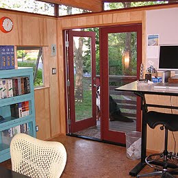
One of these is something that caught me eye by accident while doing a Goggle search on art studios. It is called a Modern Shed. Given that there is a bit of free area in my backyard this just might be the solution I am looking for.
In the third and fourth photos posted below is an interior of one the sheds. I like the angled ceiling idea with the bit of light allowed in at the front at the top in addition to that from the windows. This structure for my own use would definitely have to be insulated given the area of the world where I live and would have to figure out a way to keep it heated in the winter (solar, small gas fireplace or wood burning stove?) and have a source of electricity (solar panel mounted on top or nearby perhaps or something immediate such as running an extension cable from my house plugged into an outside outlet?).
As an artist/printmaker who uses a lot of water soluble or water based mediums (enviro friendly non- toxic thankfully) I would most likely have to construct some form of washing up area (perhaps an acrylic laundry tub that could drain into a pail underneath). I really don't want to have to worry about complicated plumbing installation so I would try and devise a practical solution for this.
Then there would be security. Maybe an alarm system that could be powered off the solar battery? Luckily I have good neighbours close by who also are around a good deal of the time so that helps.


I also did a bit of Goggle searches and found other small structures (some prefab) which might work too.


This is an interior shot of a structure made by a company called Modern Cabana


and a company here in Canada manufacture perfab spaces such as this little beauty